I did a second three-day art retreat about a week ago. This time there were no absolute losers, but there were a couple of things left unfinished. Here are the results:
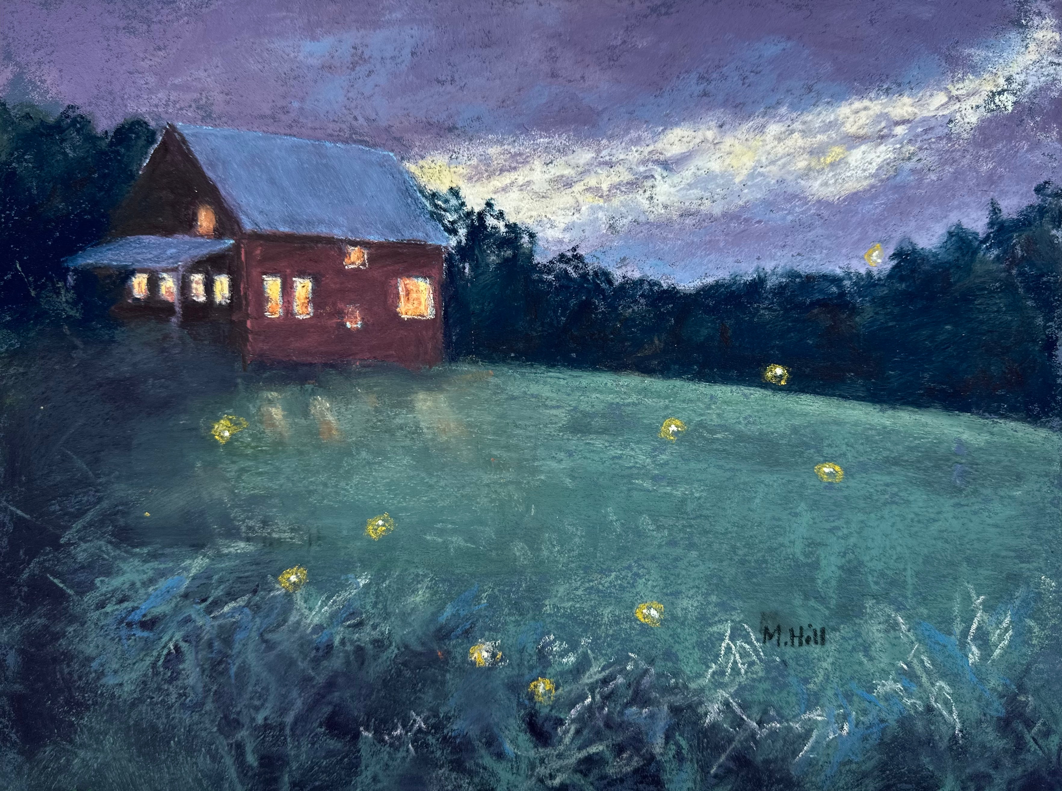
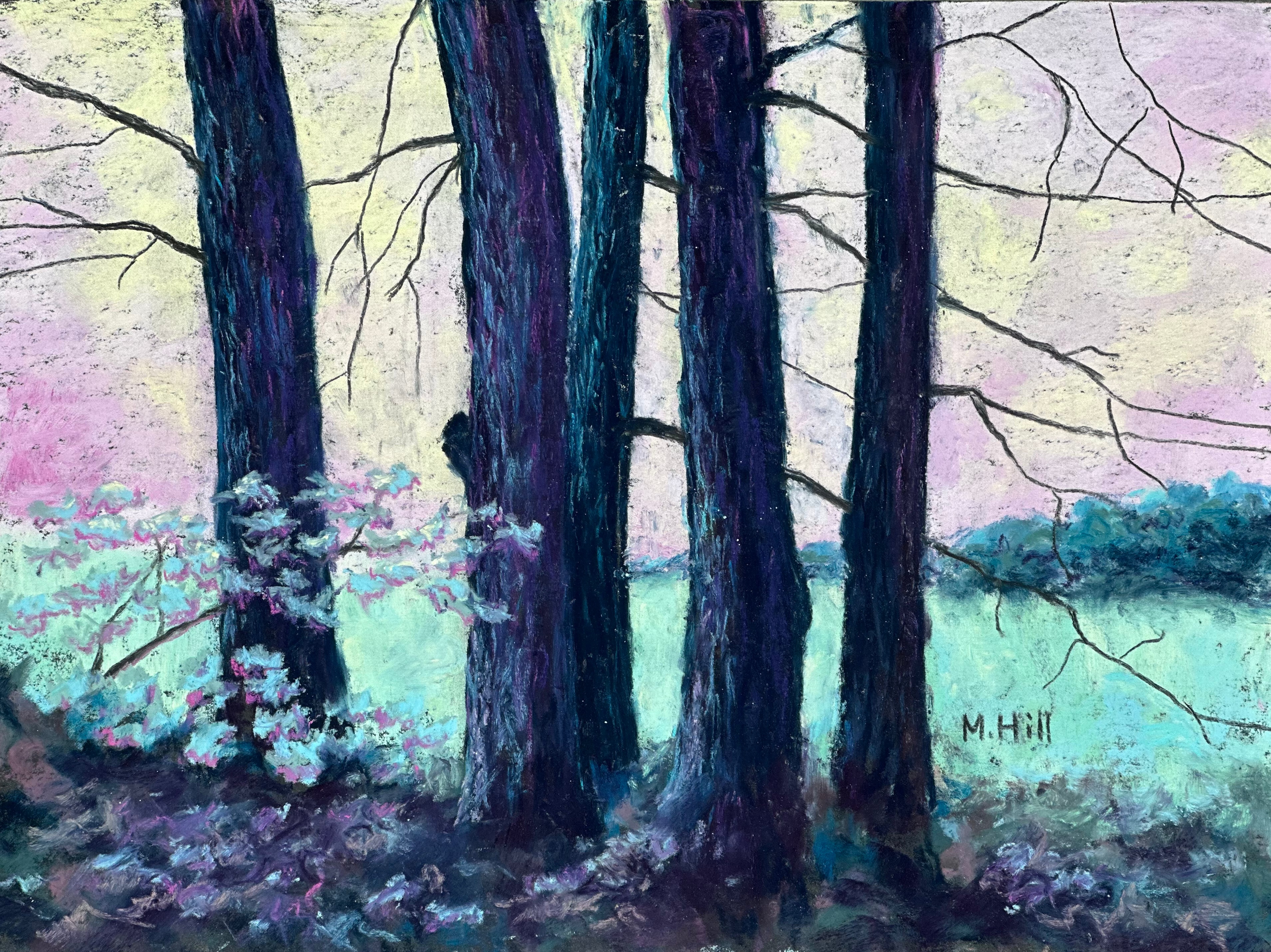
“We Five,” 9″ x 12″. I have taken many photos of this grouping of white pines that are next to the road I walk regularly. It just strikes me as a visually appealing group, and I love the implied relationship. I have photographed them in every season and I can’t really tell you what season this was except that it was not winter or late fall. I have changed the colors, enhancing the softness of the background to contrast with the stalwart images of the tree trunks. I’m pleased with the result.
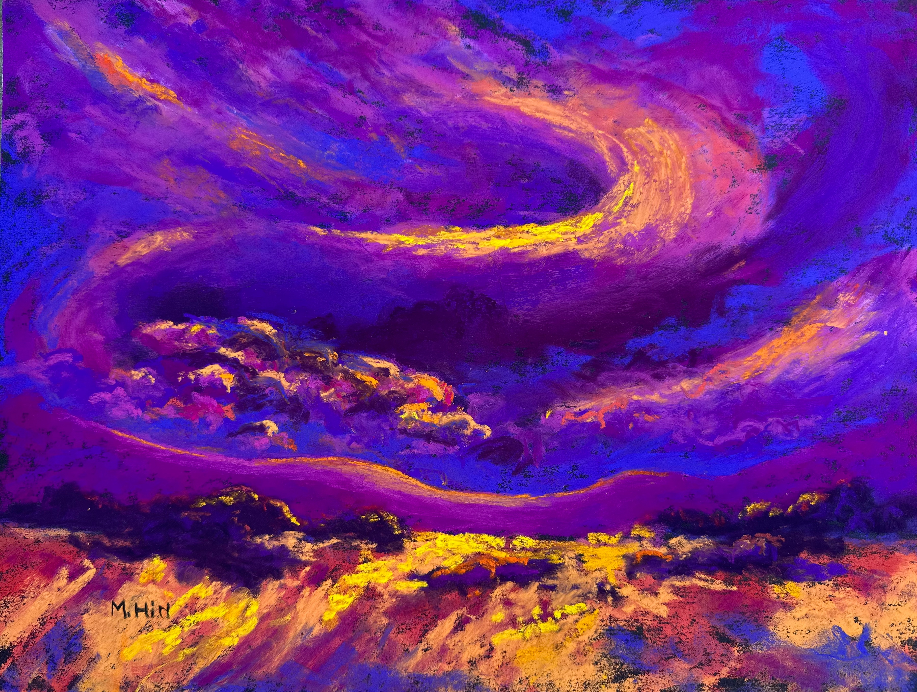
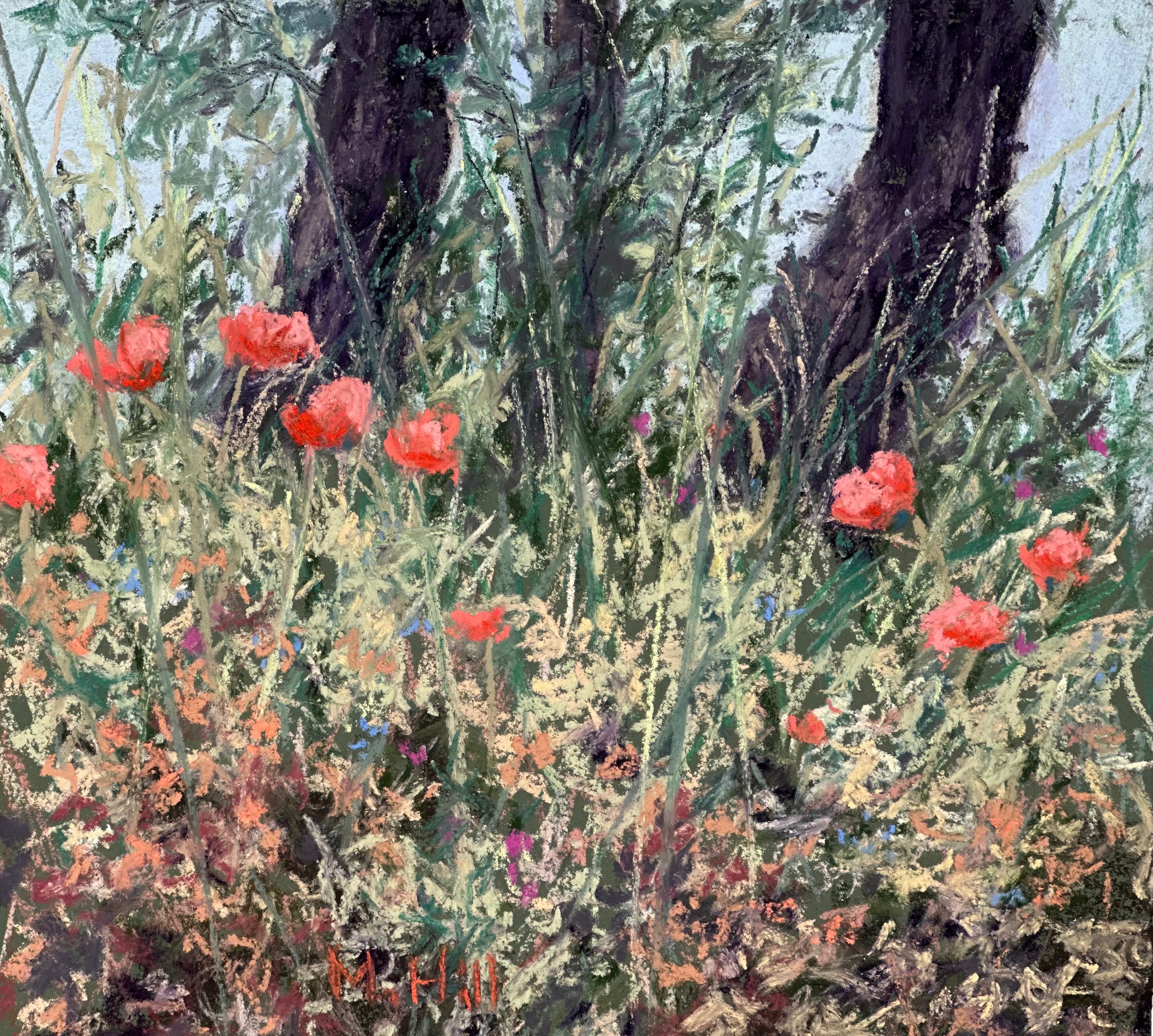
This next is from a photo I took in Scotland. It was late August and already the foliage of the weedy grasses was starting to brown and curl. The poppies, though, were brightly alive. That curly foliage, the jaunty poppies, and the dark tree trunks in the background struck me as a perfect combination. I like this painting a lot. What’s interesting to me is that my painting companion did not particularly like it. Usually we are more or less on the same page when critiquing one another’s work, but the chaos in this image just did not work for her. It’s exactly what works for me!
Thus the title: “Happy Chaos,” 8″ x 8″.
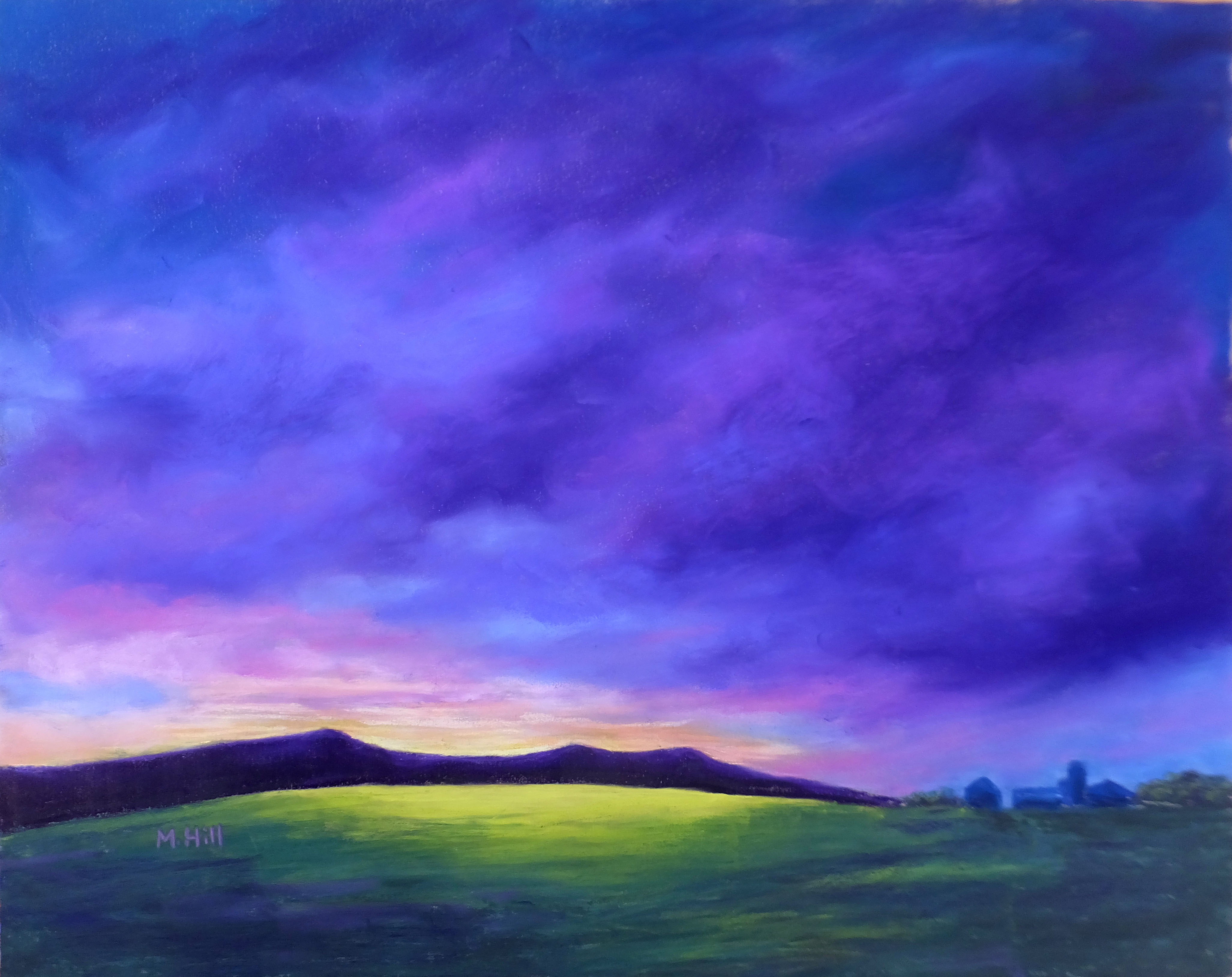
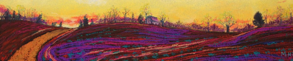
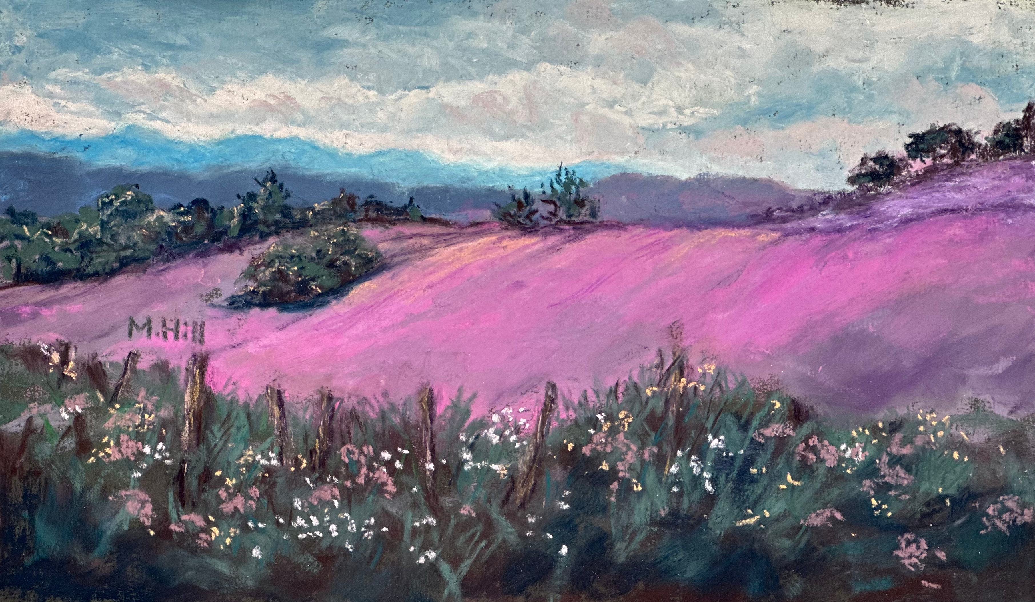
“Without Apology,” 7″ x 12″. So many of my images come from the back roads of Vermont. I remember taking this: I was driving somewhere, caught this out of the corner of my eye, reversed the car and hopped out and snapped the photo. Later, when selecting photos for the art retreat, my printer decided to act up. This photo came out dark and skewed toward magenta, and I thought: Hot diggity!” So, no, it’s not heather. The light likely tinted that hillside slightly purple in actuality, but I just went for the magenta. Why not? The title is courtesy of a friend. I posted the painting online and mentioned that I did not have a title. She suggested Without Apology,” saying that the image made her think “I can’t help it if I’m beautiful.” It’s exactly the right title.
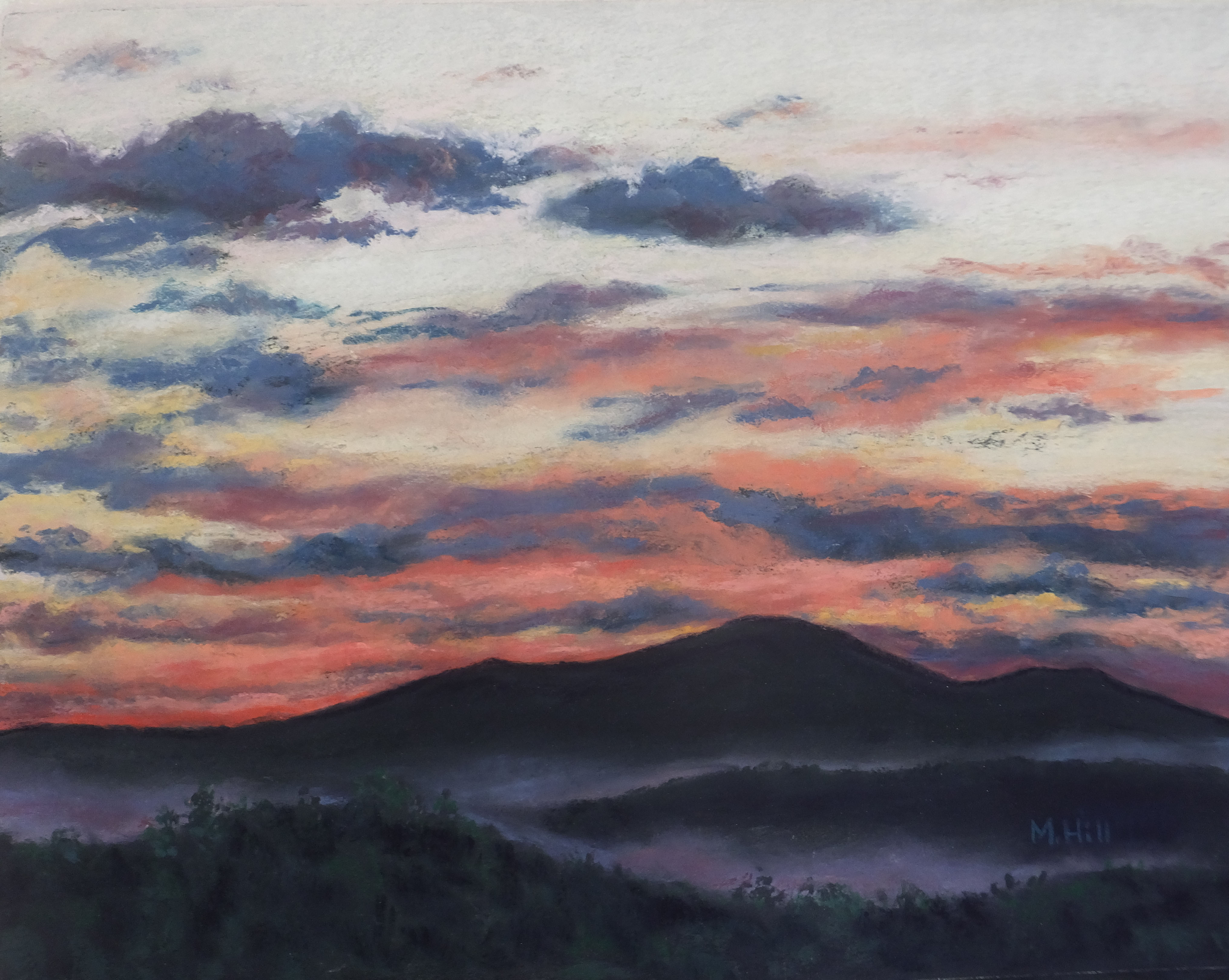
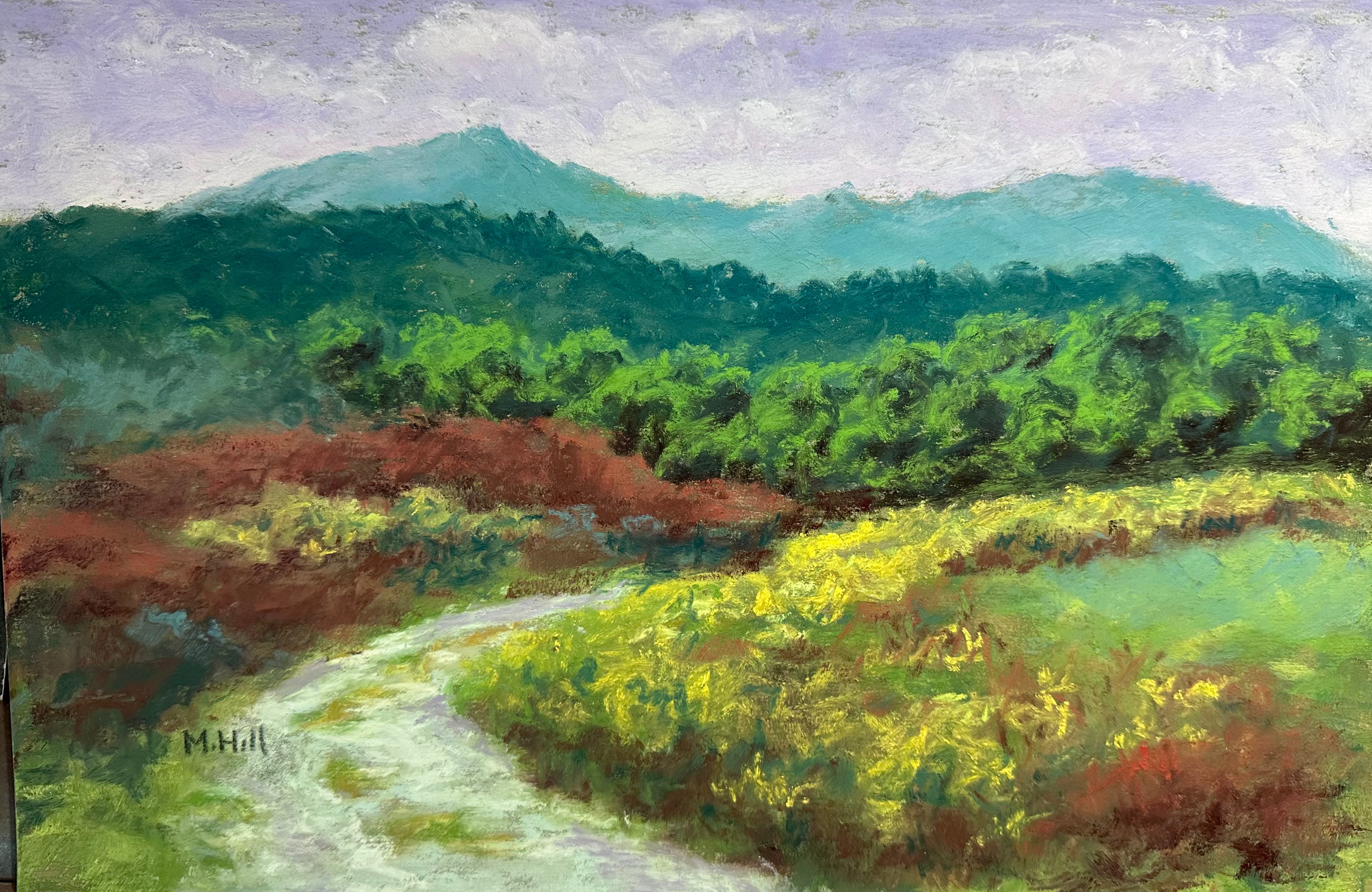
The rest of what I made during the retreat was unfinished. This one is close, though. It doesn’t quite feel done to me. I think it needs more of a focal point. Perhaps I will add a fox! If I do, I think she needs to be tucked into the brush. Perhaps I will wait and see if I feel differently about it later.
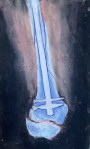
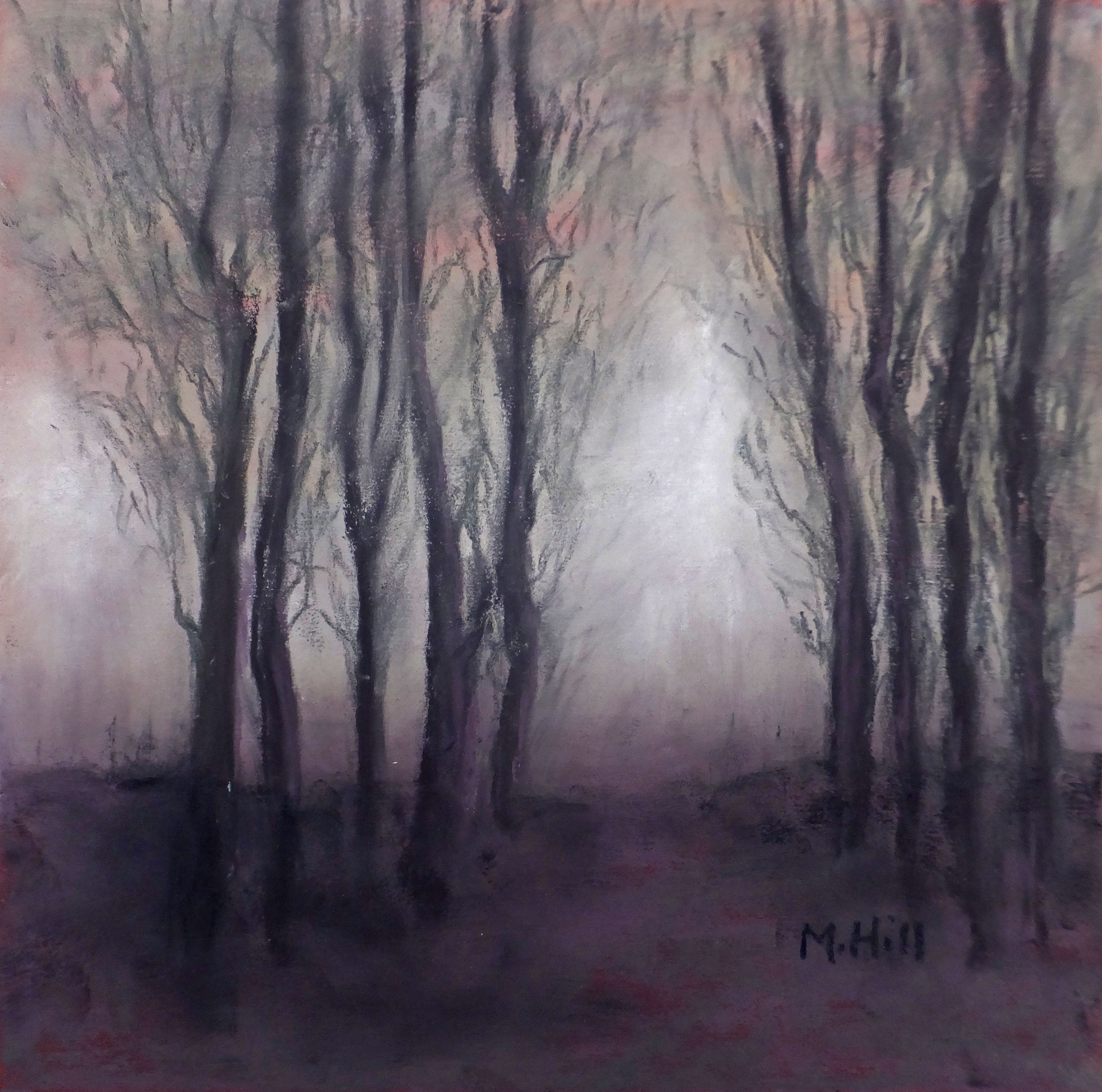
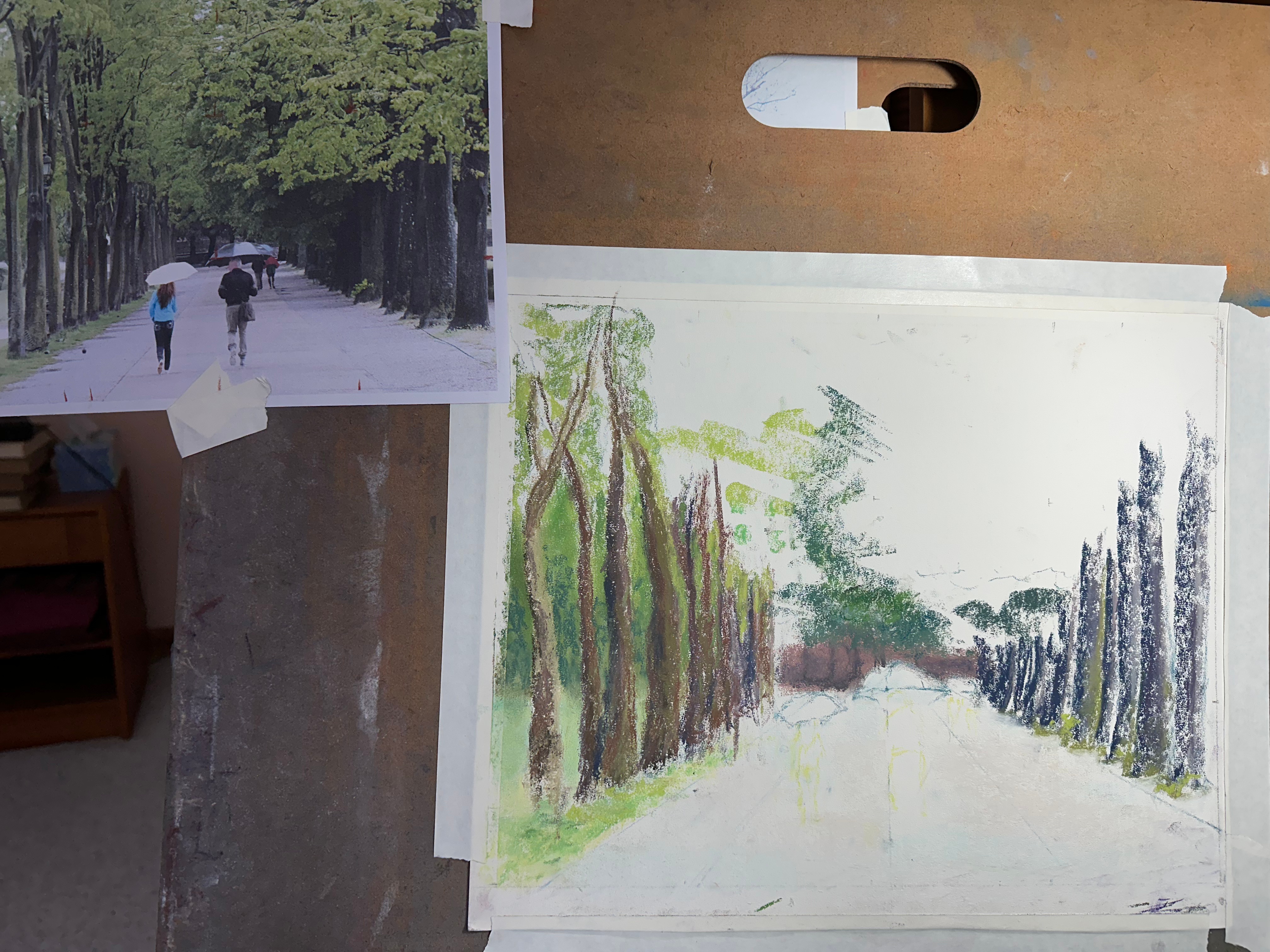
This was the start of a painting that was more demanding than I anticipated. It’s barely started, and still at the ugly phase. But I like the reference image very much, so I will continue to work on it. This is a photo of my drawing board so that you can see the reference that I’m using.
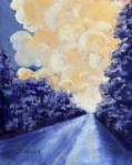
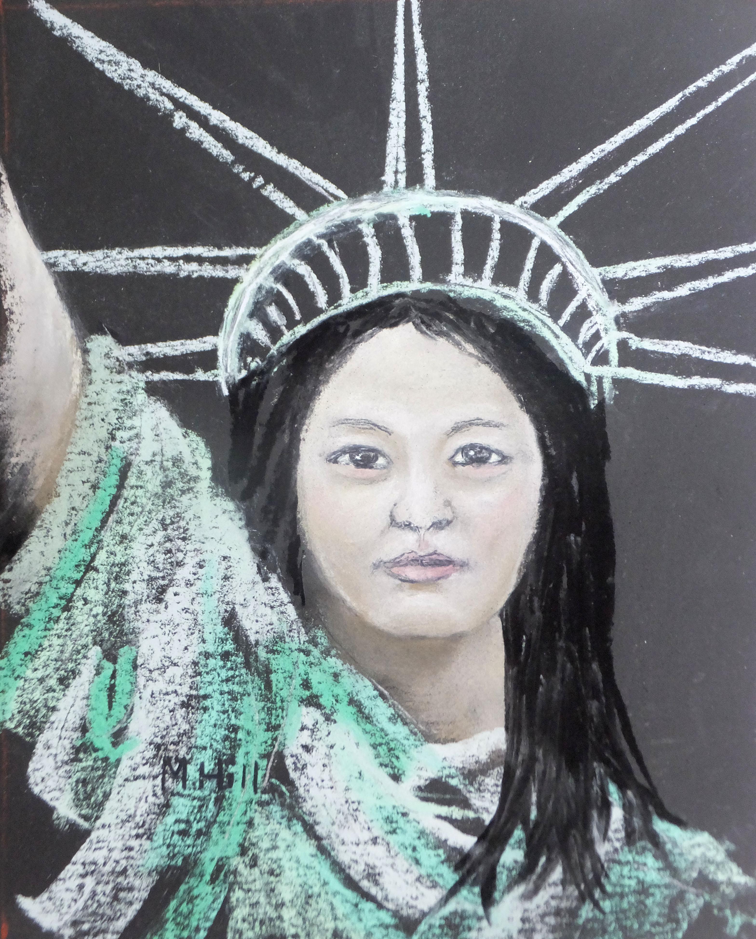
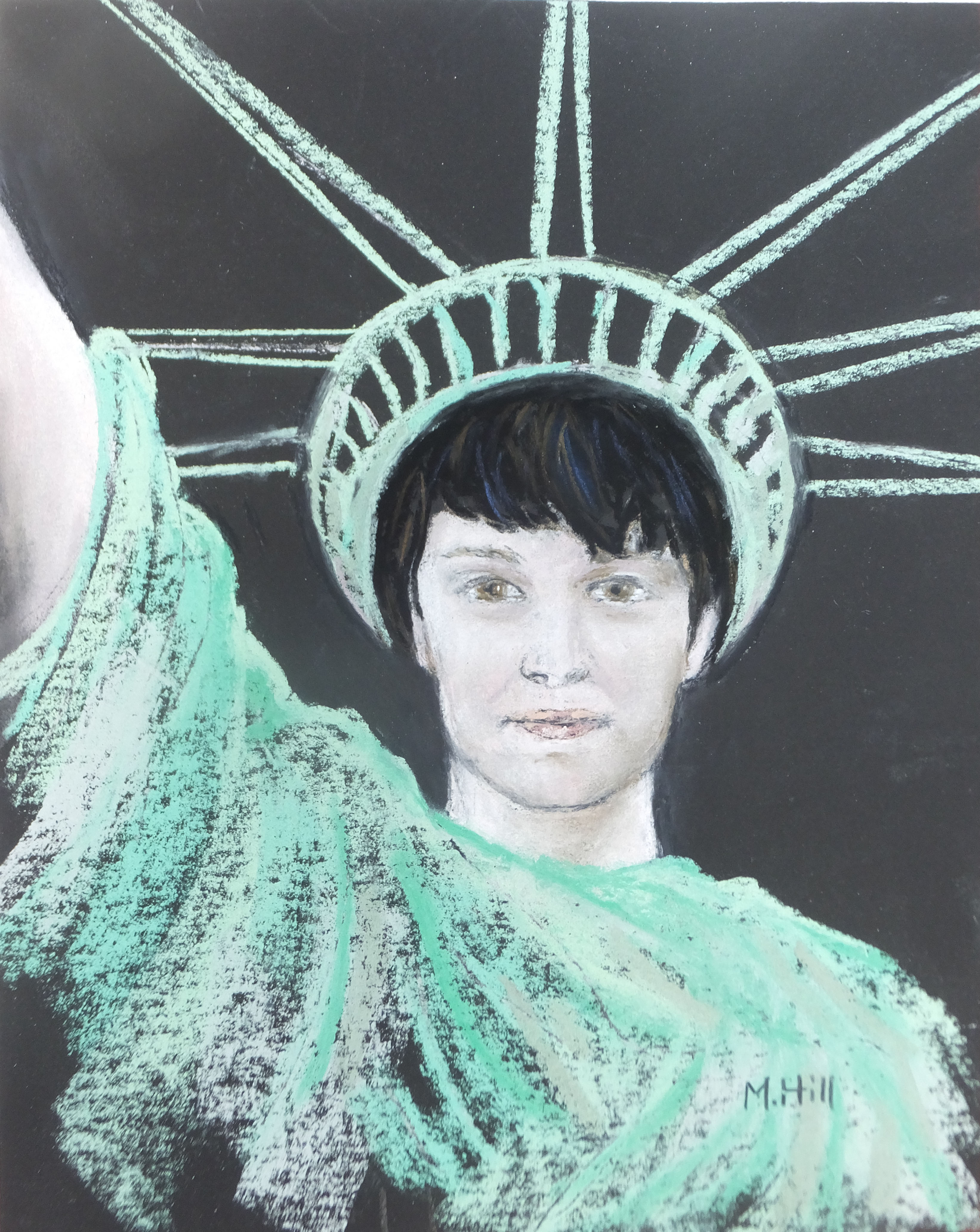
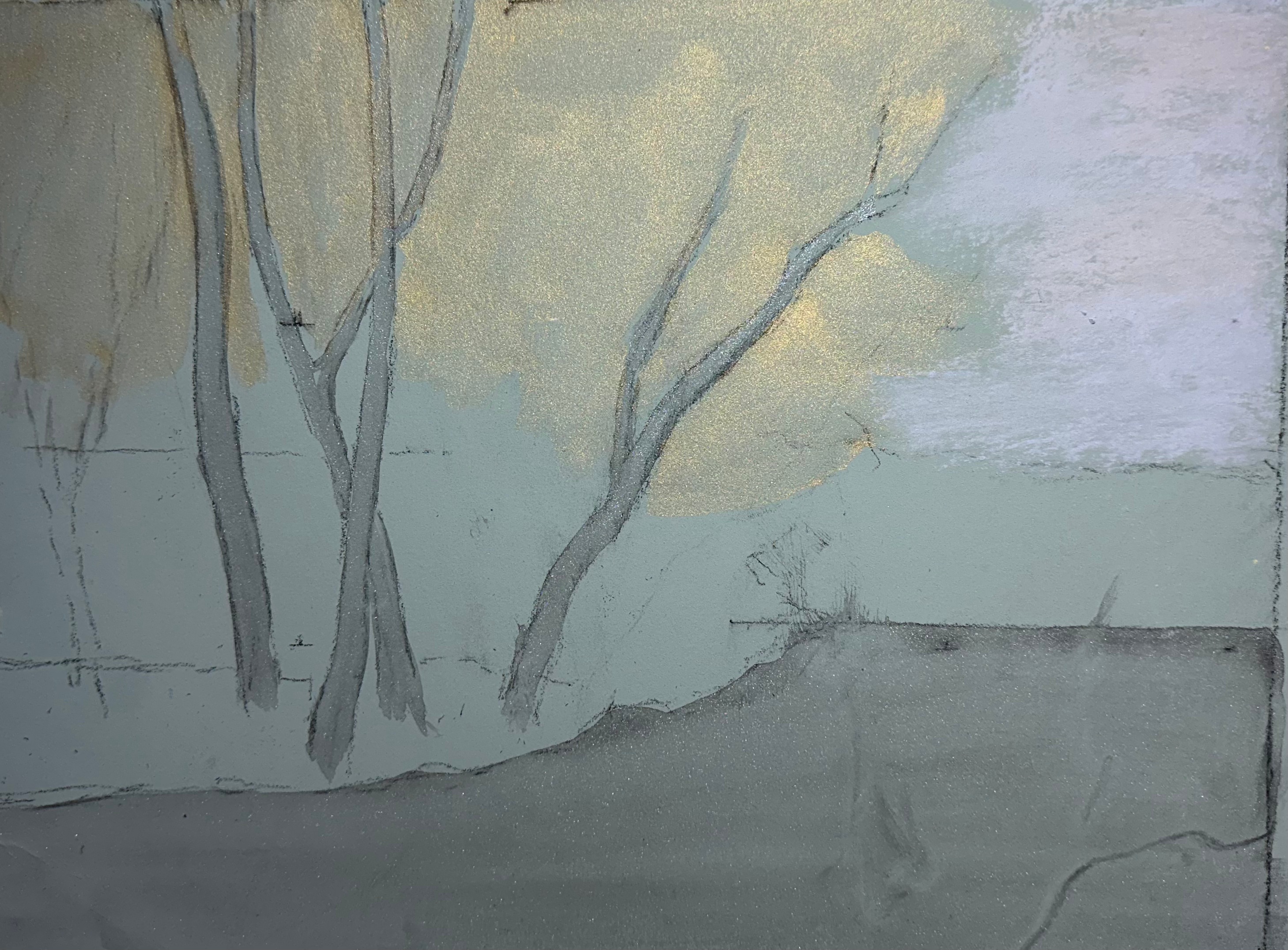
And finally, another unfinished piece. This was an experiment in using a metallic underpainting with acrylic. I don’t think you can really see the shine of the underpainting in this photo, however. I had to dilute the acrylic quite a bit so that I didn’t use up all the tooth of the paper. (Pastel paper is like sandpaper, so that the rough surface can grab and hold the pastel, which is dry. If I fill up the roughness too much, it will not be able to hold the pastel on top of the acrylic.) I don’t think t worked all that well, because although there is a slight shimmer, it is not as metallic as I had hoped. But I will return to this – it’s up on my easel now – and use iridescent pastels. I don’t think it will be as shiny as I had hoped with the metallic underpainting, but it will have shimmer.
And that’s the lot! It was a very productive three days. Usually I paint erratically: a few hours here, another hour there. It’s good to stretch my art muscles occasionally.