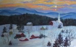
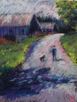
Art, I believe, is a way to see with the heart. When someone finds a painting that they love enough to buy, the creative circle is complete: from inspiration to artist to creation to enjoyment. So when I finish a painting, I sometimes wonder whose painting it is! I imagine that it belongs to someone already, and that that person will, I hope, find it and bring it home. What appeals that deeply to any of us is very personal and, in some ways, unpredictable. But, as the saying goes, you know it when you see it. These paintings have found their owners.
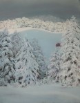
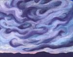 “Look Up!” 16″ x 20″. An abstracted version of a swoopy sky over Caspian Lake in Greensboro, VT. I initially painted the sky more realistically, but the painting did not say what I wanted it to say. I gradually focused more on the swirling shapes, embellishing and accentuating them. NOW it feels right!
![]() “Summer Shimmer,” 12″ x 16″. Oh, those light-drenched days of summer! It was not too far from the winter solstice when I painted this, and I needed a good dose of summer sun. That almost fluorescent green in the sky just sings of summer to me.
“Summer Shimmer,” 12″ x 16″. Oh, those light-drenched days of summer! It was not too far from the winter solstice when I painted this, and I needed a good dose of summer sun. That almost fluorescent green in the sky just sings of summer to me.
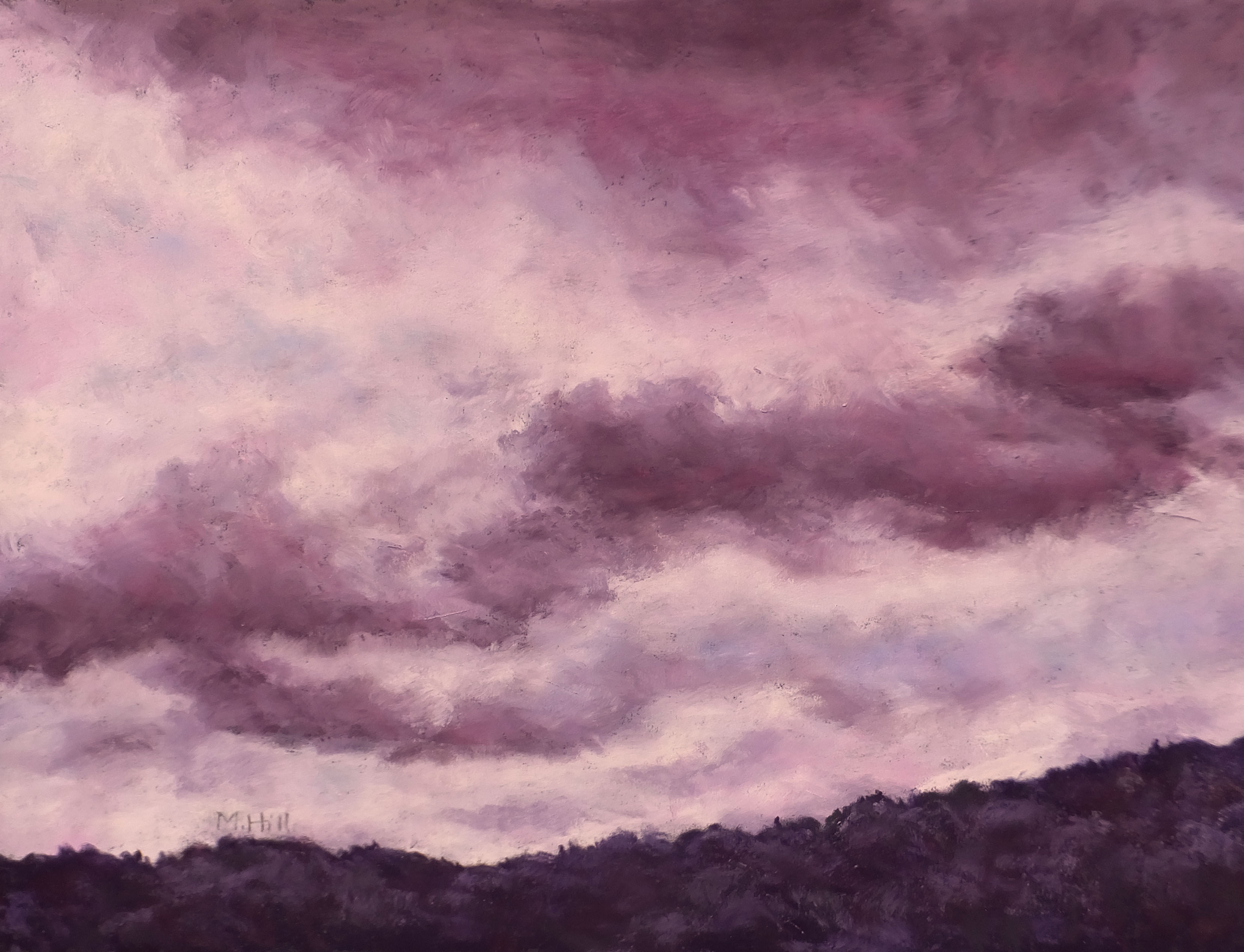
“Shapeshifting,” 12″ x 16″. That’s what clouds are, right? The shapes of these caught my eye. And of course I have changed the colors!
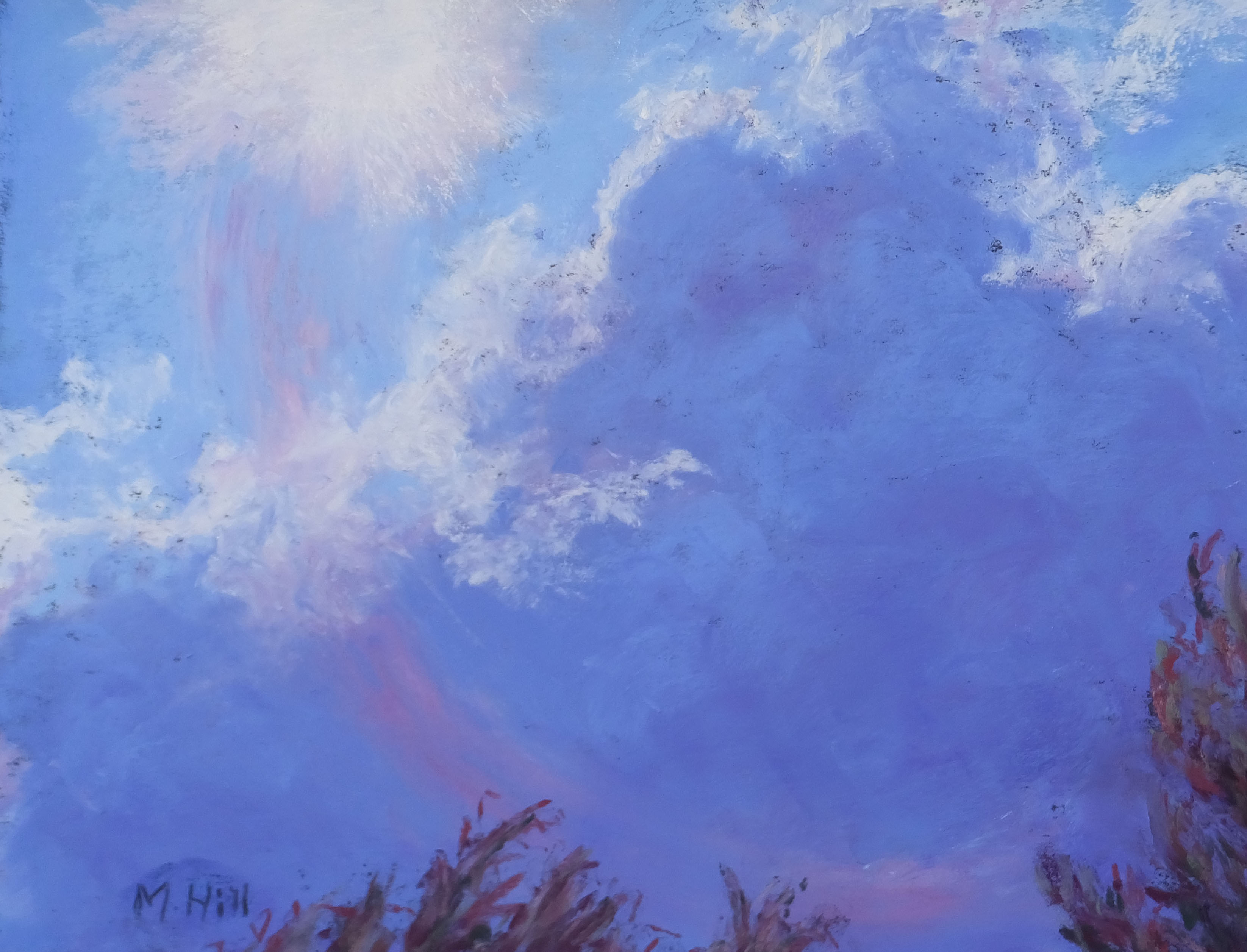
“Into the Sun,” 8″ x 10″. I took the reference photo for this one with the camera looking right toward the sun. I could not see what I was photographing, so I was glad to see that gorgeous cloud when I downloaded the photos. The camera lens made a curved magenta distortion and I decided that I liked that a lot, so I changed the shape and added to it a bit. A little odd, I know!

“An Alternative Explanation,” 12″ x 18″. This painting followed the prior one. It has a rougher, somewhat more chaotic feel. Again, I was mostly interested in the color interactions: that yellow-green against the red-orange. BAM!

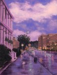
“Rainy Montpelier Night,” 9″ x 12″. This was during the night of Montpelier’s Fourth of July celebration. It poured! I really like the reflections on the wet sidewalk, and the people all tucked up against the building for shelter.

“August Arrangement,” 9″ x 12″. I underpainted this with turquoises, then had fun painting the flowers loosely and with vibrant color. I love the hot colors of late summer!
“How the Light Gets In,” 17 1/2″ x 14 1/2″. The title comes, of course, from Leonard Cohen’s moving song. This sky was the visual equivalent: so dark, and so brilliant.

“Daffodil Clouds,” 9″ x 12″. I went with family to see the bulb farms in Washington State. Such masses of color! Yet what appealed to me most was these white daffodils, not as striking as the brilliant tulips, but just glorious with the white of the clouds.
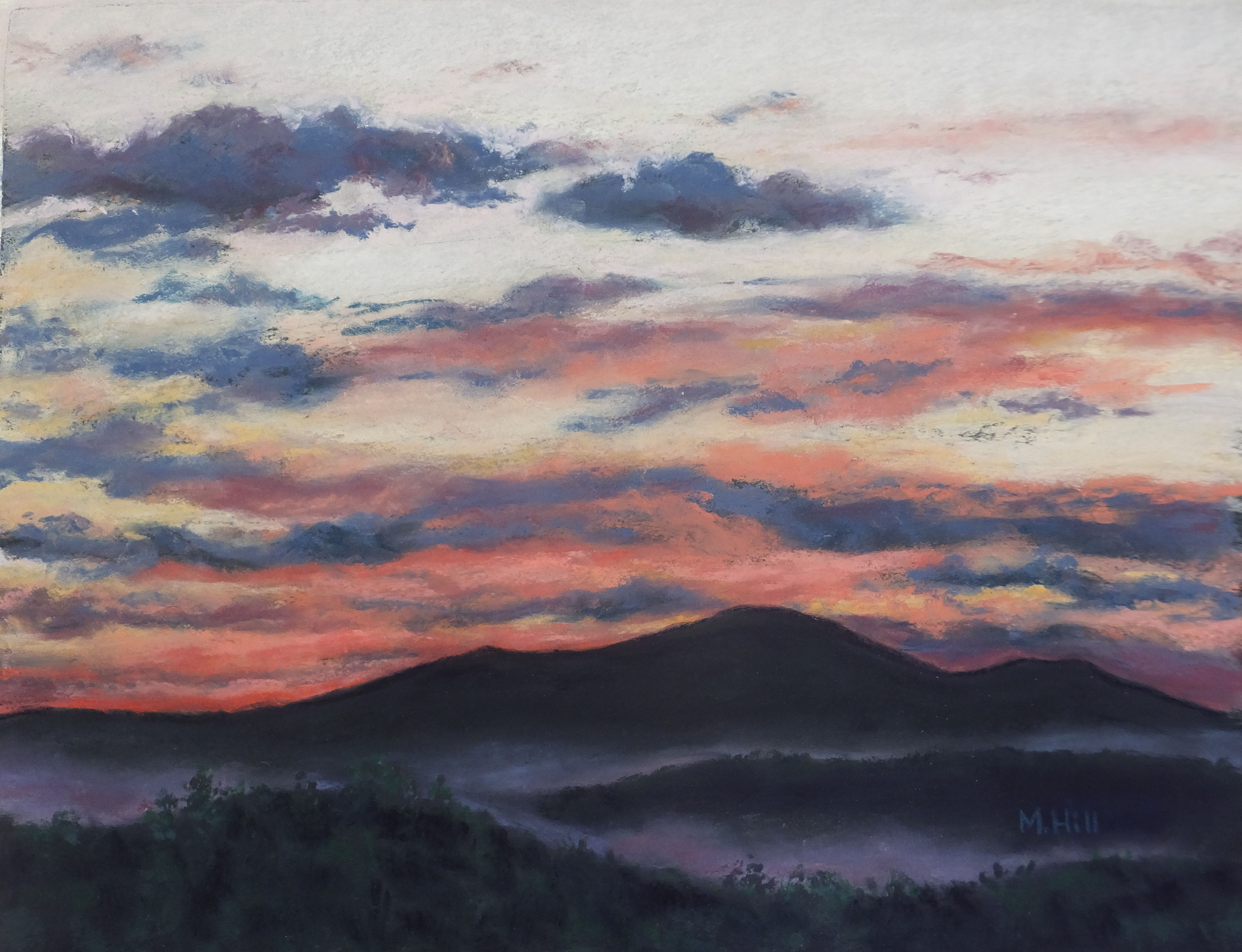
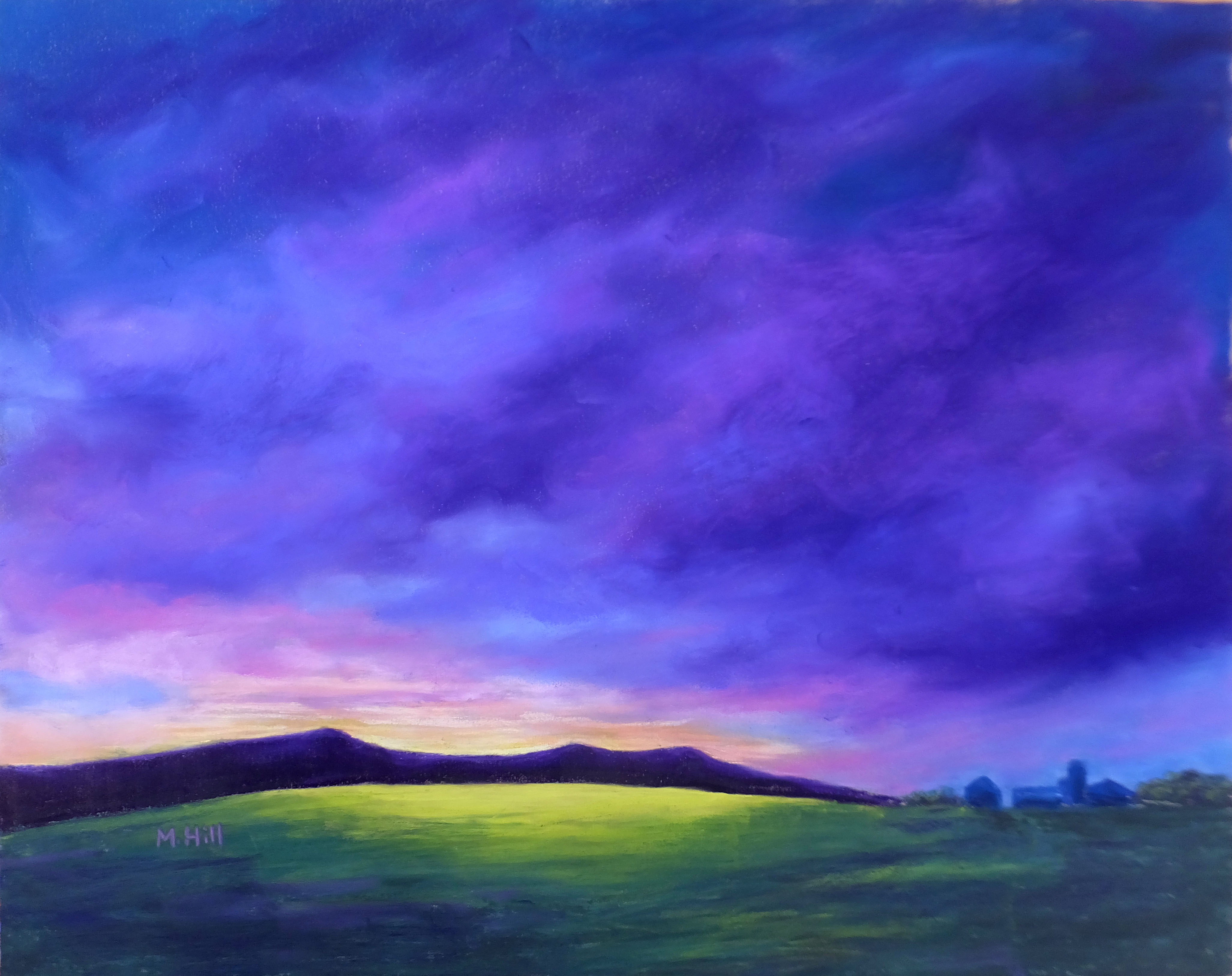
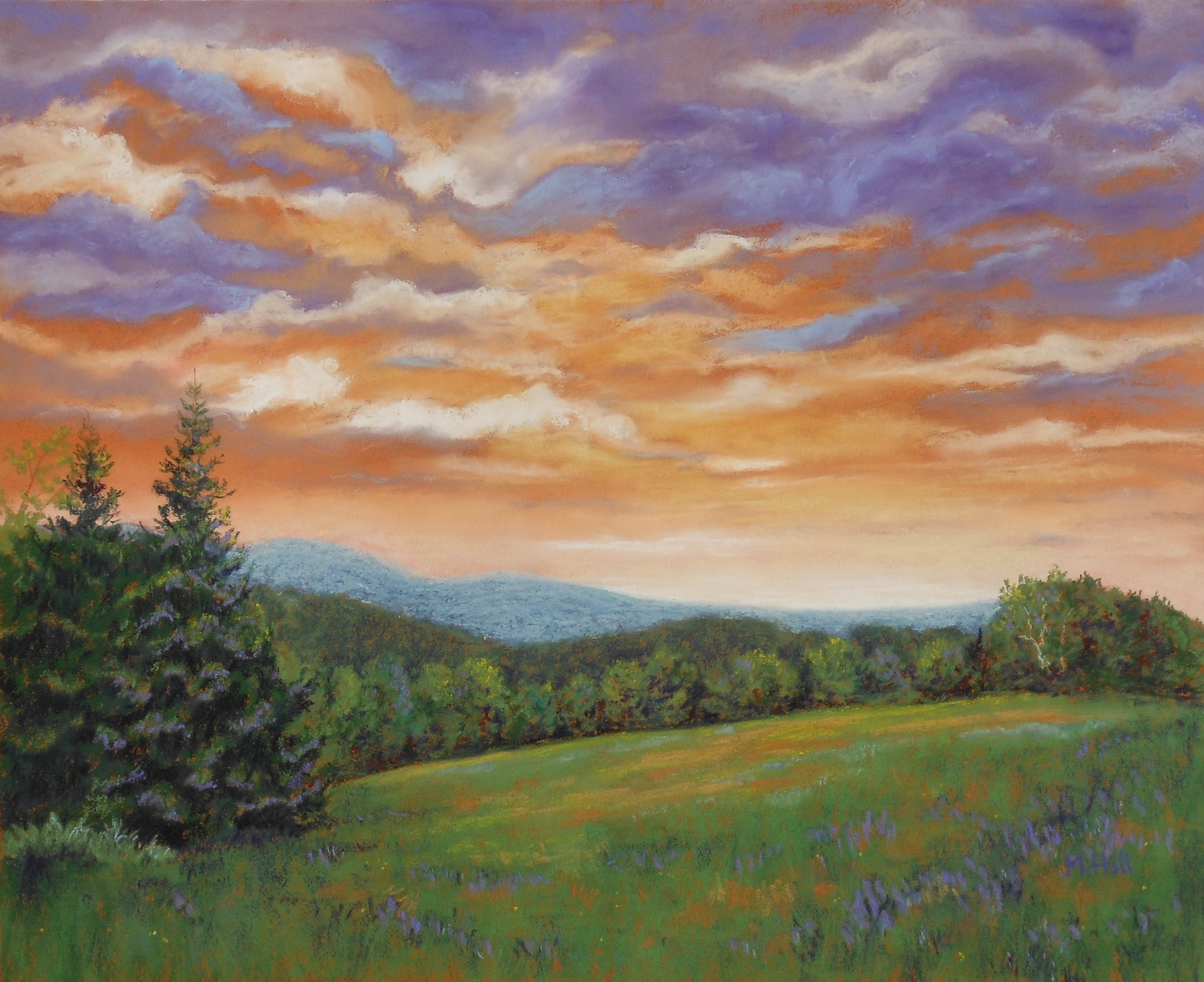
“A Graceful Ending,” 11″ x 14″. A truly beautiful sunset in Greensboro, VT. I particularly liked the shape of the mist echoing the shapes of the clouds.
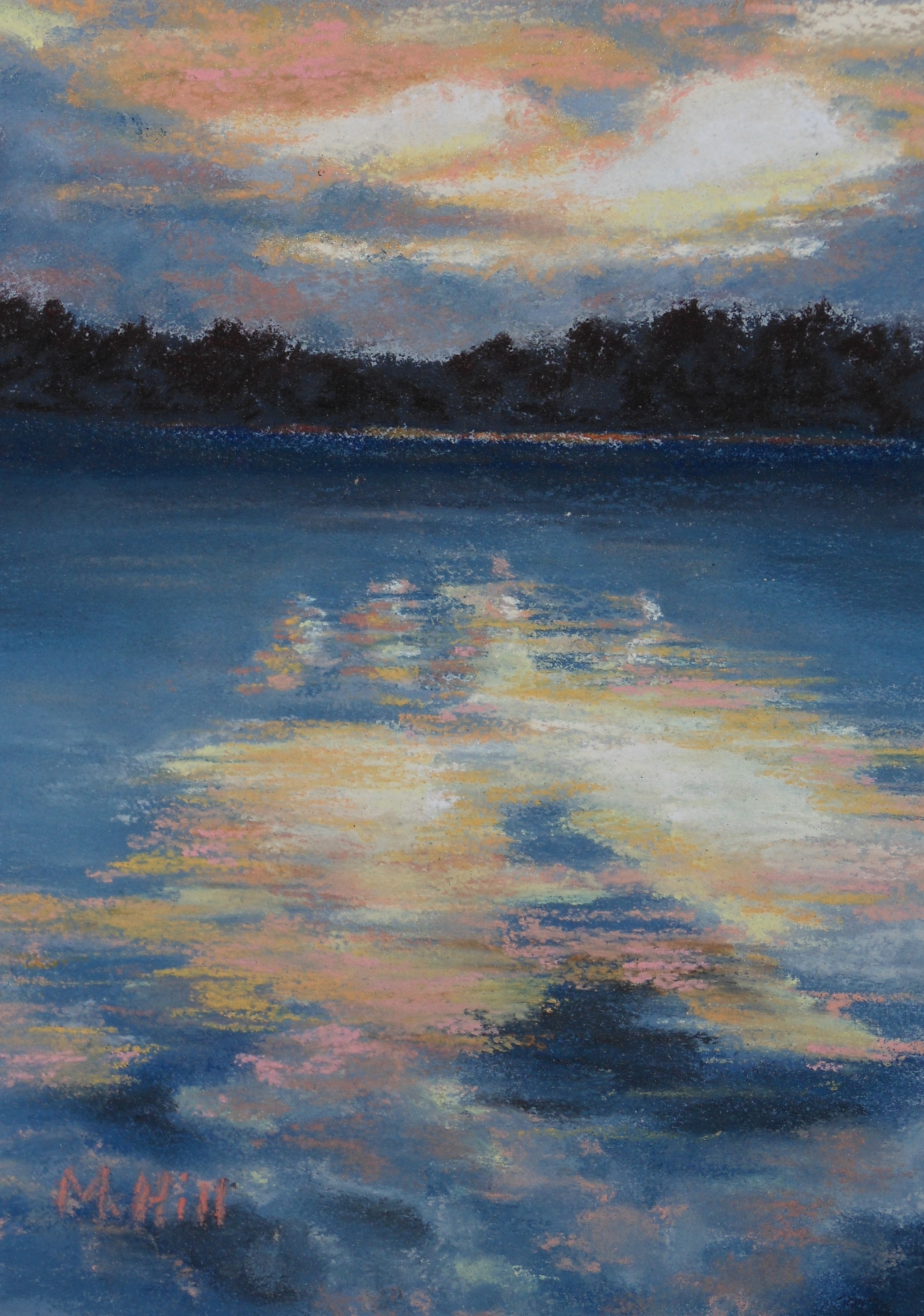
“Last Light,” 5″ x 7″. This is on Caspian Lake in north-central Vermont. I like going out in the canoe in the evening to watch the sunset. This scene seemed particularly peaceful, with the soft salmon and pale gold of the sky reflected in the water.

“View of the Bay,” 5″ x 7″. This is near the shore in Maine. I stayed there with a friend, and I still remember the amazing fish sandwiches from the summer food stand conveniently located almost next door. It was lovely to open the door and let the salty breeze in.
 “Gentle Evening,” 10″ x 8″. I took the photo for this during a winter walk in my neighborhood. For the painting, I enhanced the beautiful pastel colors in the sky, mountains and snow. I like the intimacy of this scene; you can feel yourself standing near that tree.
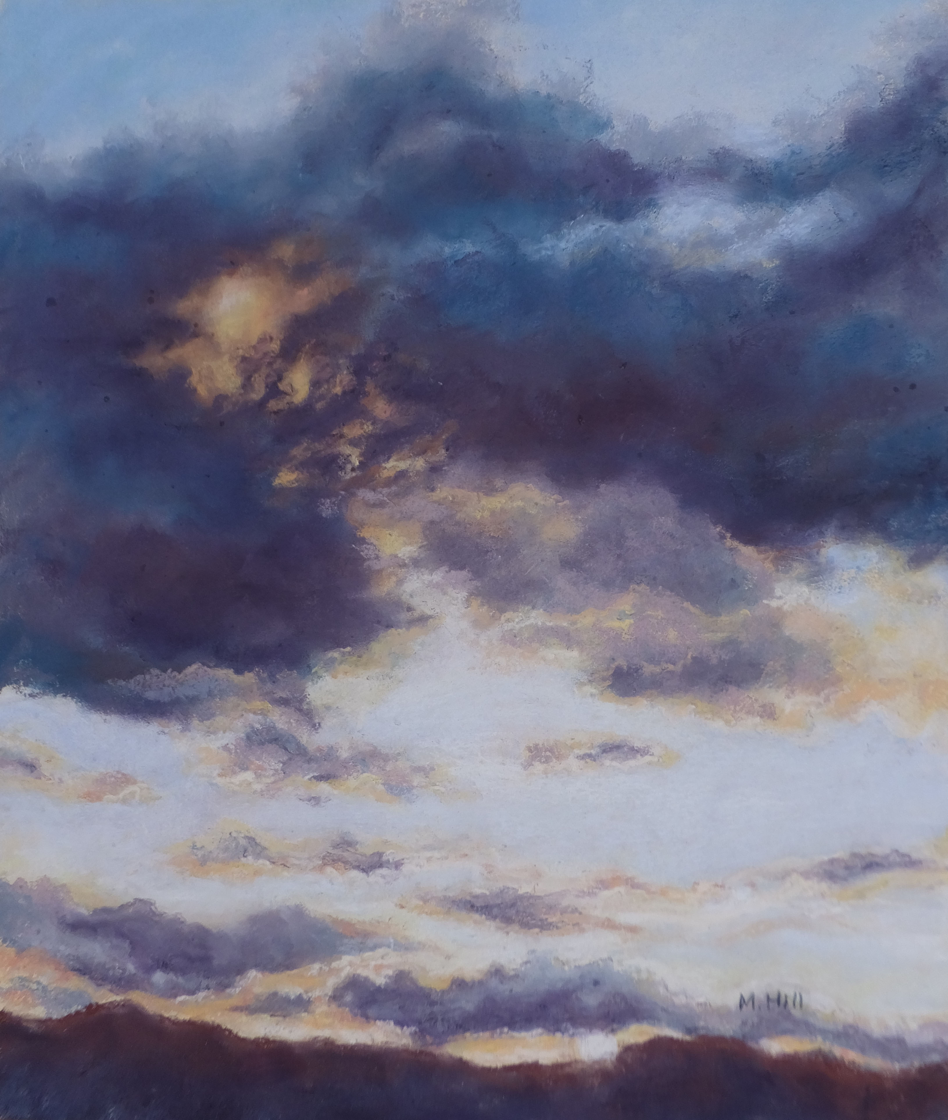
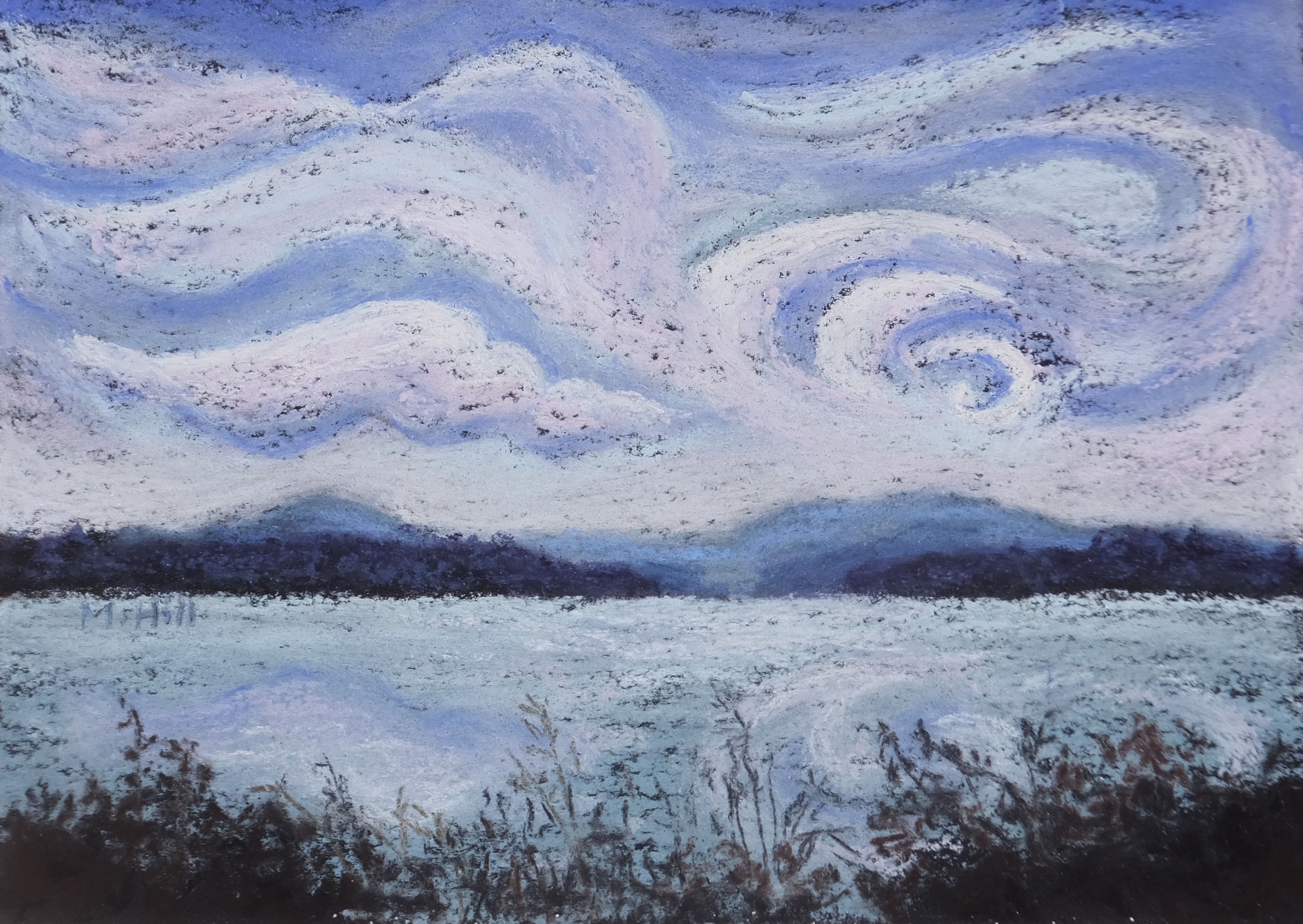
 “Restless,” 9″ x 12″. I intentionally did not blend this at all, so that the (black) paper showing adds a rough quality to the sky. I wanted to convey that restlessness in the clouds.
 “Windswept,” 9″ x 12″. As always lately, I love the clouds here, especially the sense of movement.
 “Light Line,” 14″ x 11″. Winter light can be incredibly dramatic. The snow accentuates the light and the sky, in contrast, is so often weighted with clouds. This is unusual lighting, with the sun illuminating only the far line of trees. The tiny house in the distance is enveloped by winter. This painting won a prize at the Champlain Valley Fair.
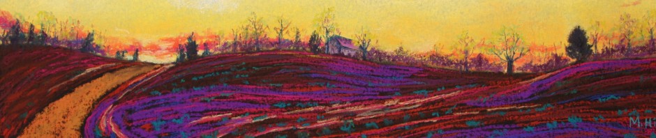
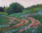
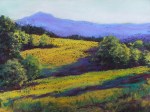
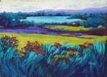 “Yin-Yang Landscape,” 12″ x 16″. The title refers to the contrast between the quiet of the lake and the fiery movement and color of the foreground. This is Caspian Lake in Greensboro, VT. I like this very much: the vividness of the colors and the rhythm of those grasses make me happy!

“June Rhythm,” 18″ x 24″. This scene is in Calais, a neighboring town. I was completely enamored of the patterns the rows of corn made. And it made me happy to translate that into purple and teal stripes in the foreground.

“In the Meadow,” 11″ x 14″. This meadow is in East Hardwick; that sweep of grasses and brush had such beautiful movement to it. It was such fun to make it even more alive with hints or rich red and oranges.
 “Champlain 1” and “Champlain 2,” both 5″ x 7″. Same view, two interpretations. Here is the other:
“The 2020 Landscape 1, 11″ x 14”. I found myself searching for images of “desolate landscapes” online. The Scottish moors fit the bill, and I altered the image, including adding a heavy layer of clouds. Yet it’s beautiful as well.’

“The 2020 Landscape 2,” 8″ x 8″. Here, I hoped to show the haunted quality of our collective experience. [NFS]
“First Light,” 16″ x 20″. This is the first landscape that I have painted since the pandemic started that expressed light and hope. Yes, the clouds are dark and heavy and cover much of the image. But the light! It is too soon to tell how this country will fare politically, but at least we have competent people making an effort. Vaccinations have begun. Finally, hope!
“Daffodil Clouds,” 11″ x 14″. I visited a bulb farm in Washington State recently, and what a show! These white and yellow daffodils were not the brightest flowers, but I was taken with how the white flowers almost seemed like an extension of the white clouds.
 “Cupcake!,” 9″ x 12″. This was so much fun to paint! Look at that soft blob of icing, yum. It’s a watercolor. I ate the cupcake after I painted it, too.

“With Cream Cheese Icing!”
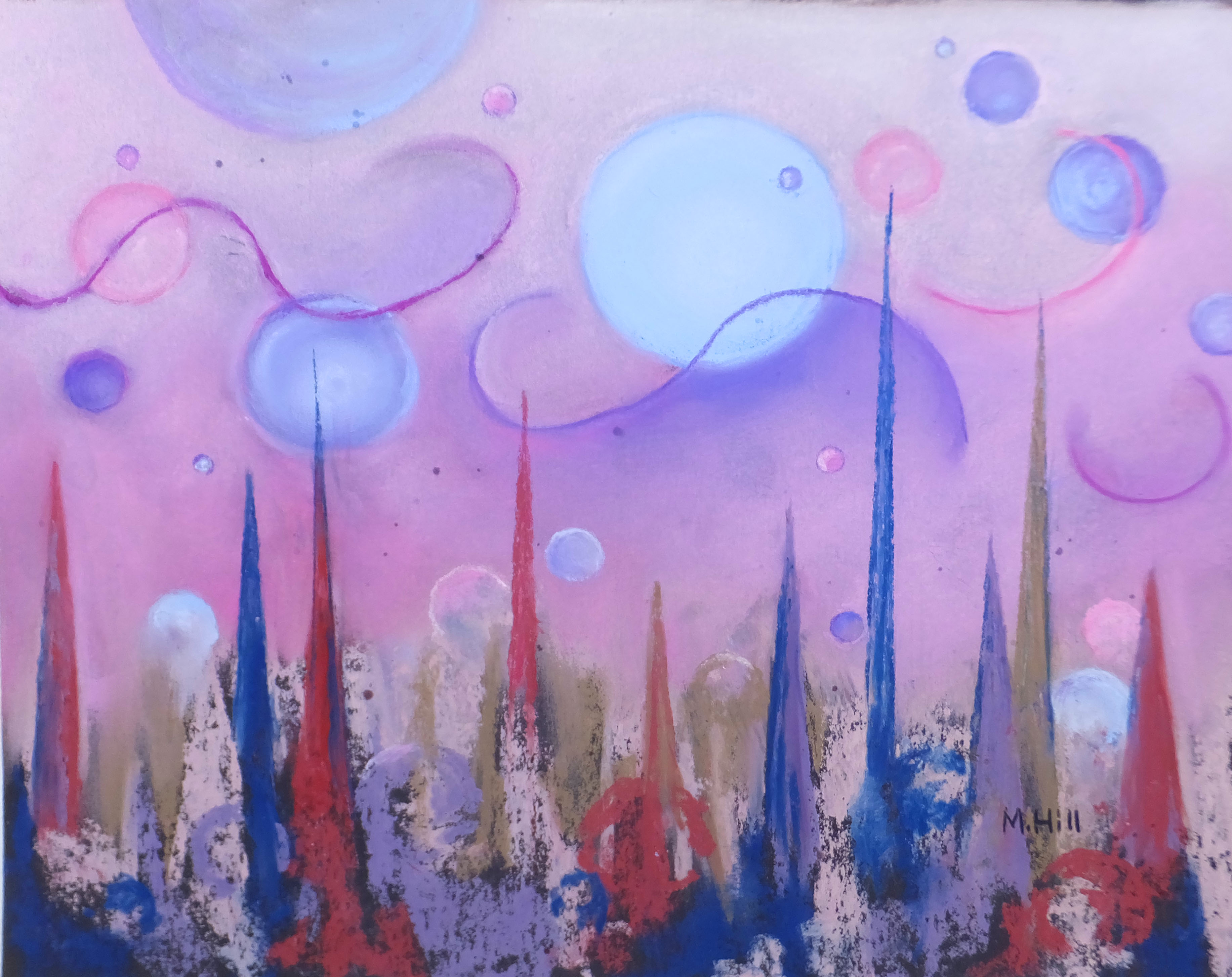 “Transition,” 11″ x 14″. This is also a painting about possibility. Much is sharp, confused, harsh. But see the beginnings of the bubbles even among the shards at the bottom? The possibility is soft and light and harmonious.
 “Dawn Glow,” 9″ x 12″. I distorted the colors here, until I was left with almost a magenta in the hills. You’d think I would be happy enough with all the color in a Vermont autumn! But that magenta adds a richness that better coveys the power of fall combined with the glow of sunrise.
 “Pasture Rhythm 1” (left) and “Pasture Rhythm 2″ (right), 16″ x 20” each. These are twinned paintings, two sides of the same field. I was completely taken by the movement in the curves of the hills and the way that the mowed grasses followed the contours of the land. It was an interesting challenge to create two pieces that were clearly related, while still making each able to stand on its own. struggled with this one, and made two prior versions (that’s four paintings!) that I discarded because they did not satisfy me. But third time’s the charm: these make me happy!
 “Sherbet Road,” 7″ x 10″. This is another interpretation of “Sky Road,” which you can see on the “sold” page. Since that one left, and I needed one of this scene for a special show (“In the Eye of the Beholder” – check out the description in “What’s New”), I figured that I would really go nuts with the color! Good enough to eat, isn’t it?
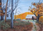
 “Fall Farm,” 8″ x 10″. Loved the red in the barn echoed by the red in the trees. I painted this on Feb. 23rd; a little visit to hot colors on this cold February day.

“Peaceful Morning,” 5″ x 7″. I went out very early one morning with a friend who is a photographer, trolling for photos to use for paintings. This is one of them. It’s very soft, all mist and quiet water.
 “Laden,” 7″ x 5″. A sweet little glimpse right outside my window after a heavy snowfall. I’ve chosen cool blues and purples: what I think of as the colors of winter.
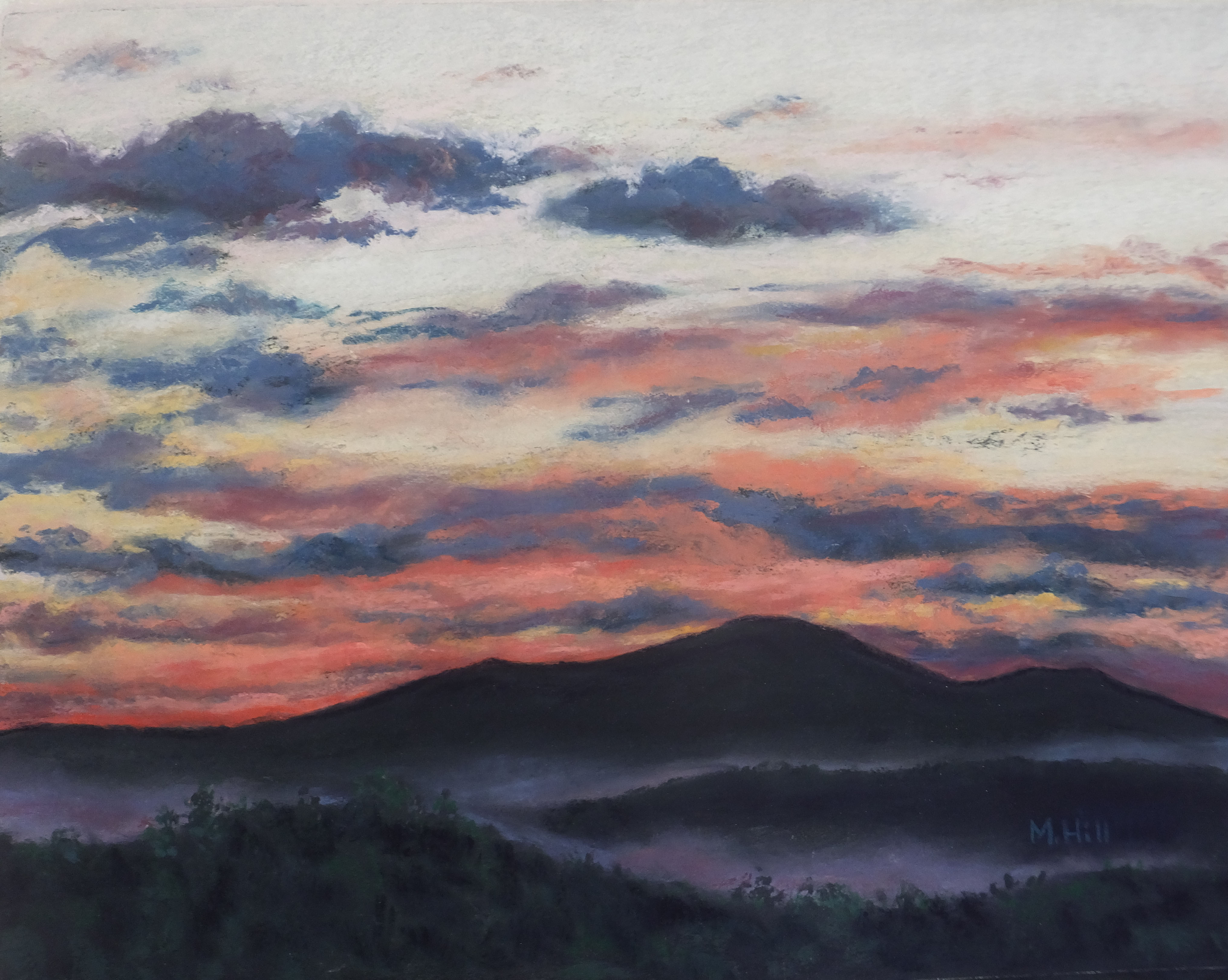 “A Graceful Ending.” 11″ x 14″. Graceful is just how this scene felt to me: the soft fog defining the shape of the hills, the many shades of peach and salmon, the contrast with the darker blue clouds. This piece sold as soon as I finished it!
“June Rhythm,” 18″ x 24″. This scene is in Calais, a neighboring town. I was completely enamored of the patterns the rows of corn made. And it made me happy to translate that into purple and teal stripes in the foreground.
 “Light Play,” 9″ x 12″. The name says it! Early morning light in the summer, washing the leaves and across the road with its brilliance. A very ordinary scene made memorable by that glow.
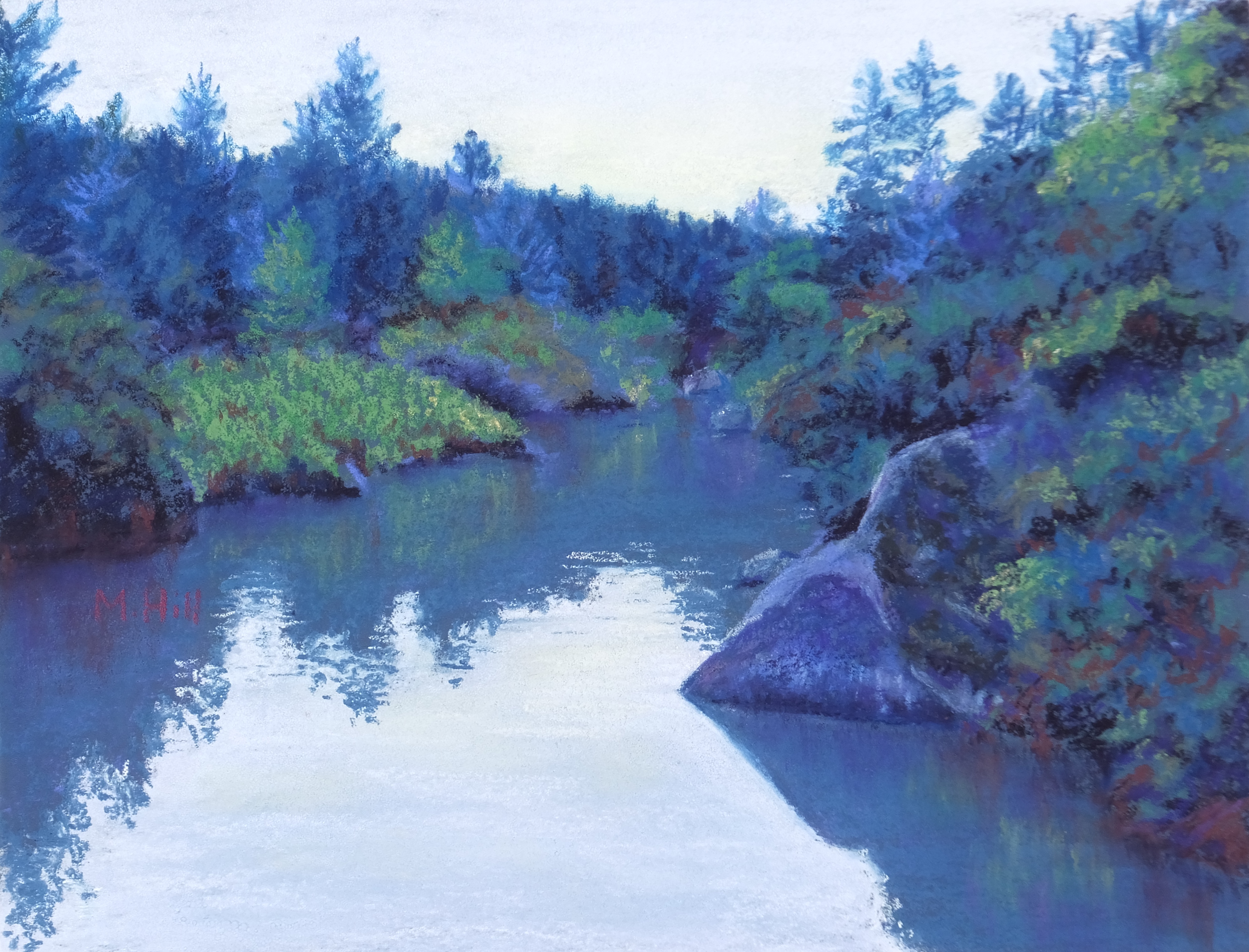 “Cool River Depths,” 9″ x 12″. This is the Black River, out behind the Art House in Craftsbury. Isn’t that pointed rock appealing? I pushed the colors toward blue to emphasize the cool mystery of the water. This painting won third place in pastels at the Champlain Valley Fair!

“Taps,” 9″ x 12″. Day is done. The close of day brings this lovely sunset: pink and peach and light magenta against the purpling (probably not a real word, but it should be) sky.
 “Lake Country Birches,” 12″ x 9″. These graceful birches seem to be watching the lake beyond. I love the serenity of this scene.
“ “Hidden Brook,” 14″ x 11″. Barely a brook, but the image of the water cutting through that intense spring green captured me. And I love the secret sunny area in the background.
 “In the Wake of the Storm,” 9″ x 12″. This scene was almost eerie, and to accentuate it I added reds to the sky. I wanted to express the sometimes unnerving quality of winter for us small warm-blooded animals!
 “State Street,” 12″ x 9″. Montpelier, VT: a summer dusk. Street scenes can be demanding, because you really need to get the perspective and the shapes right for it to be believable. But I do love the purples in this, as well as how familiar this view is for me. The country’s smallest capitol. This painting won a prize at the Champlain Valley Fair.
 “That Iconic Mountain,” 9″ x 12″. Camel’s Hump, of course, beloved of Vermonters. The zigzags of the land appealed to me here, and of course I changed the color somewhat for added punch!
 “Pastoral,” 11″ x 14″. This an everyday kind of scene in Vermont. I added some quiet drama, though, with an underpainting in warm colors that peeks through here a there (hard to see in this little photo!). I added feeling to the clouds, too, one of favorite ways to alter landscapes.
 “Headed to Camp,” 11″ x 14″. This view is indeed on the was to camp on Caspian Lake. But, as you may have guessed, the sky and grass was not magenta. I like this version so much better than “reality”!
 “Scarlet,” 12″ x 9″. I painted this in February, longing for some hot color. I did not have to exaggerate the red in the photo at all: Autumn does a hot red just fine, thank you!
 “Why I Live Here,” 18″ x 24″. Honest, this is not exaggerated. A view in my town, just an “ordinary” fall view. It’s why I live here! This just won first place for pastels in the Champlain Valley Fair!
 “Peacham Dusk,” 7 1/2″ x 12″. I don’t know what possessed me to paint a winter scene in the middle of June! Perhaps the tranquility of this small town in the soft light of dusk was just the rest I needed.
 “Forest Dream,” 12″ x 24″. This painting took more effort than most, and I kept returning to it over a period of two or three months. But it was worth it. It is no real forest, it is the dream of a forest, the magic of a forest.

“Spring Sentinels,” 9″ x 12″. Another example of spring with really strong color. This view is also at the Sparrow Farm. How fortunate I am to live somewhere with subjects for art all around me! I like the rhythm of this row of trees, each with its own character.
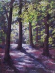 “Invitation,” 12″ x 9″. I changed the colors to express the mysterious quality of the dappled woods. My cousin said that the forest floor “is the color of tree thoughts,” which may possibly be the most perceptive comment about my art that I have ever heard. That’s exactly what I was going for.
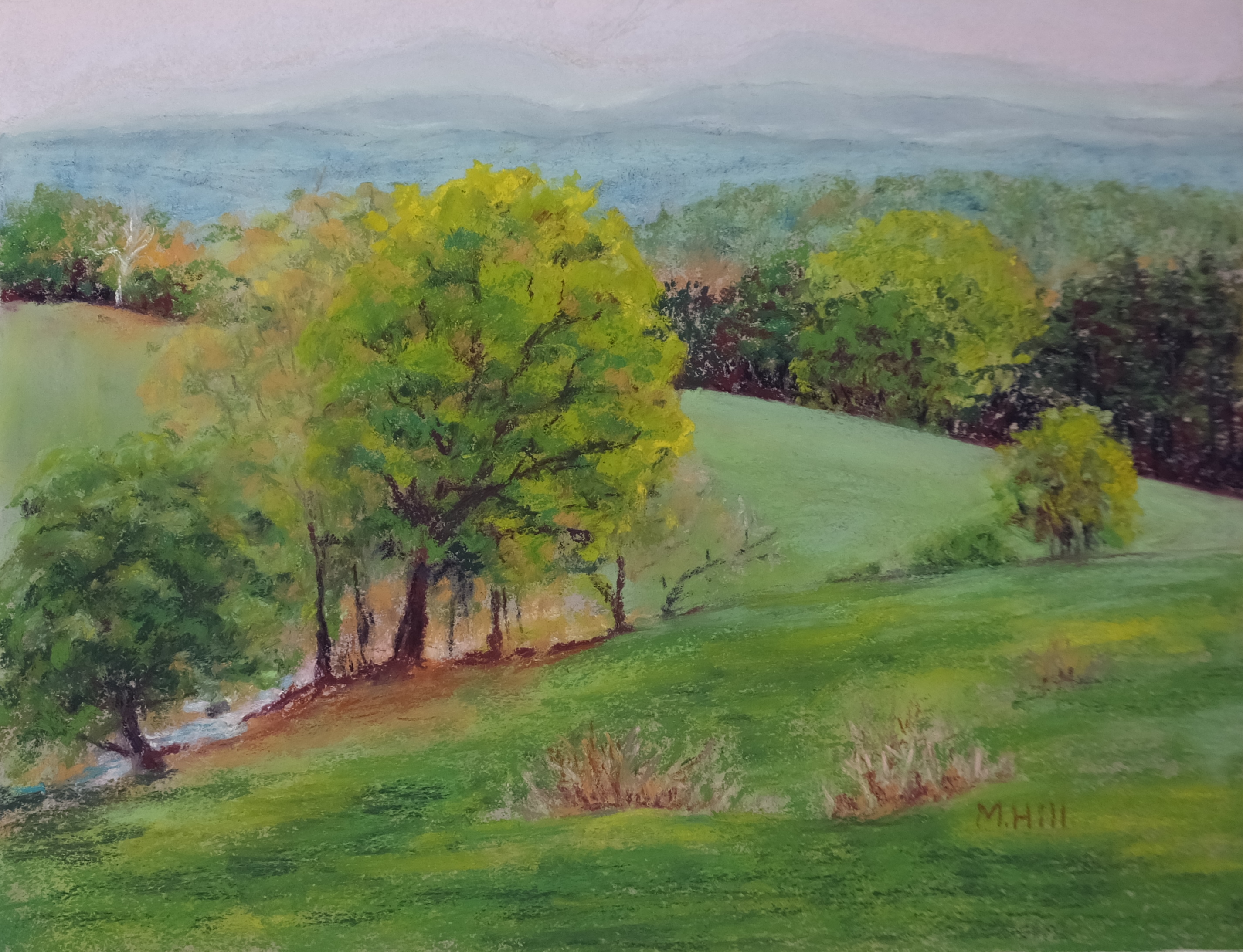
“Verdant,” 8″ x 10″. This is painted from a photo I took this May. Oh, that green, green, green of spring! It only lasts about three weeks, then darkens and solidifies into summer green. I was drawn to the color, of course, but also to the composition: how your eye follows the sweep of the hills back and forth. And those soft layers of hills fading into the sky. It’s essence of Vermont spring.
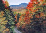
 “Stowe Autumn,” 9″ x 12″. This is a view from behind the village, partway up the mountain road. I used black paper and a light touch to create a textured effect and to accentuate the powerful colors of fall. I like the results!
“The Brook in Winter,” 5″ x 7″. I took this photo in late winter, admiring the soft colors of the brook (which I have changed, naturally!) and the way it meandered out of view.
 “Neon Cactus,” 12″ x 9″. The prickly pear have such fun balloon-shaped pads that I thought I’d make them fun colors as well. I experimented with several color combinations before settling on this one. I like it very much indeed.
 “Judy and Lily,” 12″ x 9″. Here is my friend Judy and her pooch! This is an experiment with a looser, unblended, and many-layered style. Interestingly, although the quick strokes make it appear as if it were done rapidly, it was anything but and required a lot of thought about color layers.
 “In Green Pastures,” 12″ x 16″. I really like the drama that a black background gives to a painting. In this case, the sweep of that bright yellow-green against the black was (if I do say so myself!) stunning.
 “Softly, Softly,” 9″ x 12″. Such a soft and lovely pastel-colored dawn! One gift of walking in the mornings (until the cold drives me inside in the winter) is the variety of dawns, and this one was especially evocative.

“Glorious,” 6″ x 11 1/4″. Sunset on Caspian Lake in north-central Vermont. I painted this on sueded card, which is like painting on butter, mmmmm. The texture of the sueded surface adds a depth and richness to this scene that I don’t think I would get with my usual sanded paper. Oh, my, it certainly was glorious!
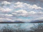
 “Sky and Lake Conversation,” 16″ x 20″. This is Caspian Lake in northern Vermont. The conversation, as you see, is between the glorious sky and the gentle water, a conversation about light and color. This painting sold the first time I showed it, at the Wood Art Gallery in Montpelier, VT.
 “Holding the Sky,” 24″ x 18″, acrylic. This was my first attempt at painting in acrylic. They handle very differently indeed from pastels. The tree is roughly modeled after a photo of a local tree, but the sky, of coursed, is invented. I like how the curve of the tree’s limbs appears almost to carry the clouds. [
 “Between Heaven and Earth,” 18″ x 24″, acrylic. In one of those unexplainable artistic impulses, I decided that I wanted to paint the aurora borealis. Not an easy subject, it turns out! But there is something deeply mysterious about these lights in the sky; in this case, they are echoed again in the water below.
")
“Spring Pop,” 9″ x 12″. OK, so it turns out that you can amp up spring colors just as well as fall colors. It seems to me that this kind of color overload better expresses the aliveness that I feel in nature. Nature is not only sweetly beautiful, but often is grab-you-by-the-throat-and-shake-you beautiful.
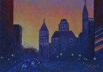
“City Dusk, ” 5″ x 7″. This is Albany, NY, painted from a photo that a friend took. I wanted to try a night (or almost night) scene, and this is the result. It was fascinating to see how many variations on dark I could use: dark red, dark purple, etc. I particularly liked the glow of the sky contrasted with the shapes of the buildings in this scene.
 “Winds of Change,” 16″ x 12″. My first foray into abstract art. For me, this was a more feeling-driven process than representational art, although both are informed by spirit. I especially liked the boldness of this piece.
 “A Prickly Perch,” 12″ x 9″. Watercolor. I was surprised to see how the desert birds perched without a care on the cacti, including the saguaro. I guess I should not have been – after all, they make nests in the cacti too! Some birds make holes in the saguaro and then raise their young right inside. Perhaps this bird has a nest.

“Hollyhock Window,” 9″ x 12″. I saw this near Hardwick, VT. The window reflected both the sky and the dark shapes of the hollyhocks – lovely!

“Spring Layers,” 10 1/2″ x 6 3/4″. I was well and truly weary of winter and wanted a spring scene to paint! This appealed to me: those layers of early green in the distant trees, the band of misty fog you see in the spring, the middle-distance meadow contrasted with the close-up grass, and in front of the entire scene, the tree branches with their new yellow-green leaves.
“Softly, Softly,” 9″ x 12″. Such a soft and lovely pastel-colored dawn! One gift of walking in the mornings (until the cold drives me inside in the winter) is the variety of dawns, and this one was especially evocative.

“High Summer, Quebec,” 18″ x 24″. This is from a photo taken during a trip with the two artists I paint with regularly. It’s hilarious to travel with other artists. We saw this field and are all yelling, “Look at that! Pull over! Pull over!” then scrambled out of the car to take photos. But when we developed the photos, they were disappointing, somehow not conveying the sweep and rounded beauty of the hills and planted grains. Art to the rescue! I exaggerated the curves, amped up the color in the foreground, and purple-d up the background foliage. Now, THAT is closer to what we saw! Here is one of the reference photos, below, so you can see the difference.
 “Green Fire,” 9″ x 12″. A simple scene, but I have made some not-so-simple changes to it. The colors are pushed toward blue-green. But, even more fun than that is the swirly and curly shapes that I used for foliage and the foreground plants. In fact, the yellow-green plants in the foreground are shaped more like flames than leaves!
 “White Birch, Red Maple,” 12″ x 9″. I liked the columns of color in this scene: the dark green of the evergreen, the gold, that amazing red, and then the stark, almost leafless birch with its lighter green. The maple is the star of the show here! It was an overcast day, with nothing in the sky or in the pale gold of the grasses to detract from that brilliant scarlet.
 “Sycamore,” 16″ x 20″. This was a commission for my cousin. Here it is in its new home:

“Sinuous,” 12″ x 9″. This is a more abstract take on “To the Mountains” (you can see that painting in “More Traditional Landscape”). This was very interesting to do. I used a triadic palette: green, yellow, and purple. A great combination, and I do like this slightly abstracted version.
 “Desert Companions'” 12″ x 9″. Prickly pear and (I think!) brittlebush. The brittlebush is a beautiful almost-white soft gray-green. I “pinked up” the prickly pear a bit for contrast, although some of them do indeed have a little red or purple in their pads. I liked the way these two plants intertwined.

“Fall Fishermen,” 9″ x 12″. It’s hard to see in this small photo, but the fishermen are indeed there, in their red boat. I hope they got lucky! I exaggerated the foliage, but just a little; Vermont in the fall boggles the mind. And eyes! This is Curtis Pond in Calais.

“Tulip 3,” 5″ x 7″. A tulip closeup from underneath! I like the contrast of the purple background.

“Tulip 4,” 5″ x 7″. Mmmmm, red, red, red.
“Jamie’s House,” 29″ x 21″. A portrait of my friend Jamie’s home in New Hampshire. Oh, the light on that far hill! Her brother, her dog, and I (by implication: my car is in her drive) are there as well. This sold right off the easel.
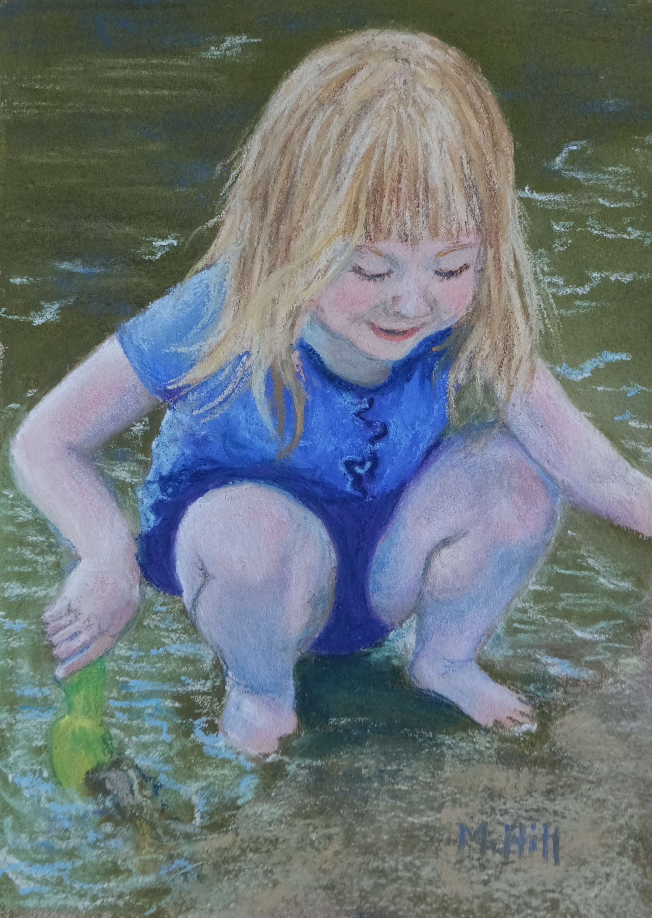
“Bella,” 7″ x 5″. This is the daughter of an acquaintance, having so much fun playing at the edge of the lake. Kids know how to be in the moment.

“Snowshoe Trail,” 9″ x 12″. I took the photo for this painting from a friend’s window in the late afternoon. Of course, the reality was much more muted than this, with hints of those colors only imagined. In fact, here is the “real” scene, below. But this painting is the true scene!

You can see the same structure as “Snowshoe Trail” in this photo, but showing the spirit required (ahem) a few changes.

“Last of the Gold,” 9″ x 12″. Another central Vermont scene, my lovely home territory. I shifted the colors in this scene, making the grass, the wood of the tree and fence, even the sky a little more gold to emphasize the feeling of late autumn. Everything seems to glow as fall closes.

“Fall Hideaway,” 9″ x 12″. My neighbor’s barn, greatly exaggerated. But I like to think of this as a little cabin tucked behind the fall trees. Autumn in Vermont certainly lends itself to playing with vivid color.
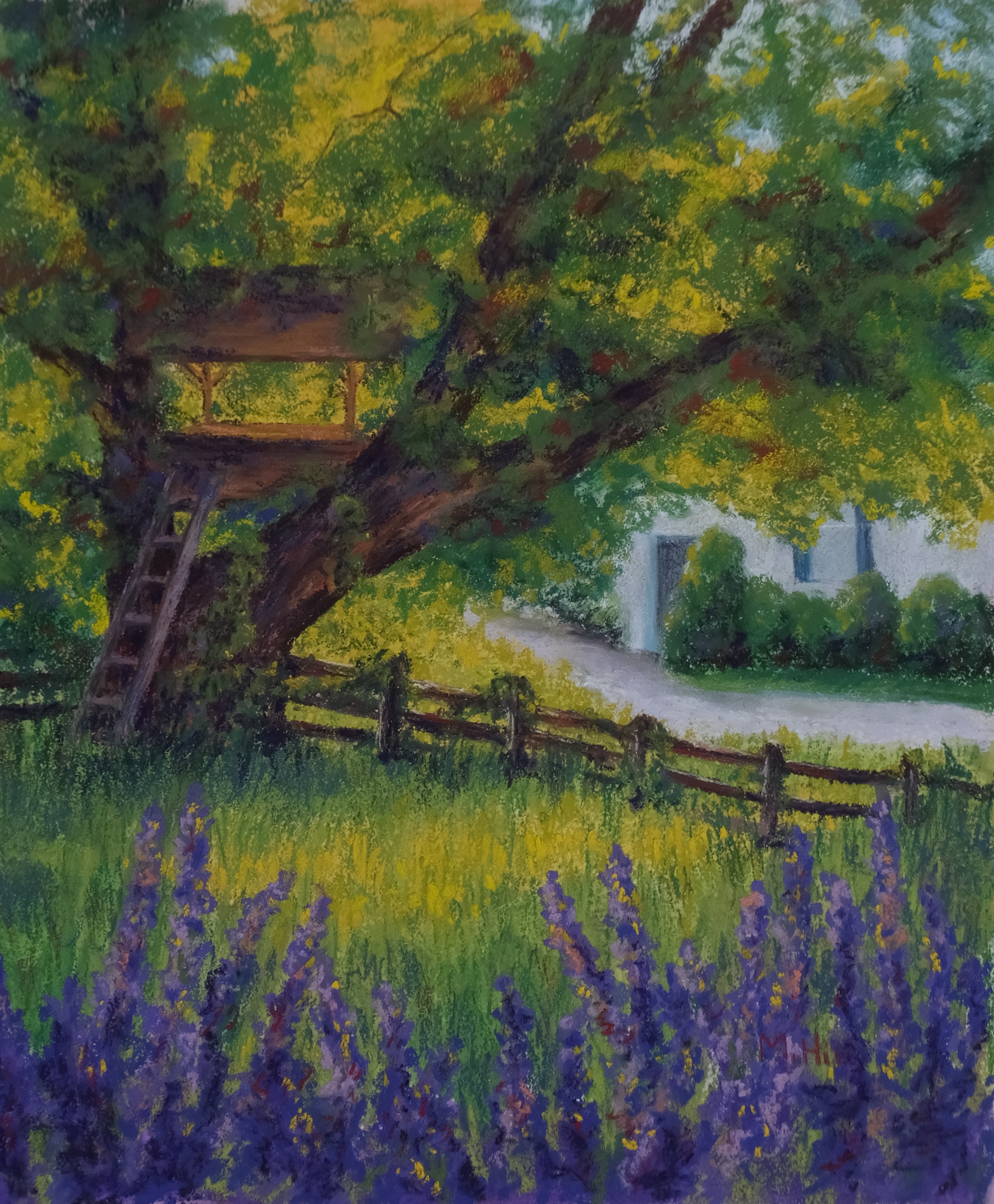
“Wanna Play?”, 14″ x 12″. Not sure whether you can see it in this little thumbnail, but the painting is of a treehouse, thus the title. I was so drawn to the way the late afternoon sun lit that gracious old tree from behind. It was the perfect place for a treehouse. Wanna play? I do!

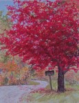
“Rural Mailbox,” 9″ x 12″. It’s not my home, but this scene is a kind of universal template of home. The front door light is a beacon in the growing darkness. This house is in Worcester, my home town.
“The Happy Couple,” 14″ x 20″. This also sold right after I made it! Do you see the two little trees at the very end of the road? One of the Art Rules is always to use odd numbers of things, and in general it is more visually pleasing to do so. But I put two trees here, and then flaunted it with the painting’s name. The photo I used had a gray sky with some lighter clouds, but I made the sky clear with the clouds sweeping around: much more beautiful, I think.
“Enchanted Afternoon,” 16″ x 20″. Another “hot-off-the-easel” sale, sold before it was even exhibited anywhere! Here, for your entertainment, is the photo I used. The difference between reality and art!


“December Walk,” 9″ x 9″. I caught this lovely couple strolling along Montpelier’s Langdon Street Bridge, which was decorated for the holidays. The lights embedded in the new snow were so magical!

“Beginning,” 6 5/8″ x 9 5/8.” This is from a photo I took at dawn when out for a morning walk on my road. The delicate colors of the sky are a beautiful contrast with the silhouetted trees.

“A Single Flame,” 12″ x 16″. I have been eager to paint this scene ever since I took the photo about a year ago. The sky in that photo was layers of gray, but this blue and purple seems much more deliciously dramatic to me. The tree was actually almost that color; fall foliage is dramatic without any help from me!

“Goldenrod,” 9″ x 12″. I underpainted this in warm reds, and let those colors peek through to emphasize the heat of late summer.

“Summer in Vermont 2,” 9″ x 12″. Here’s the second one. As you can see, I am naming the series “Summer in Vermont.” Nothing says summer like creemees! In this one, I decided to make a clear Vermont theme by adding an arc of maple leaves and a soft mountain background. To make the maple leaves, I went out and picked sugar maple leaves, laid them out on the floor, and took photos that I could then use as a guide. This, like the other creemee paintings, has a kind of stylized, graphic quality, which is a fun change for me.
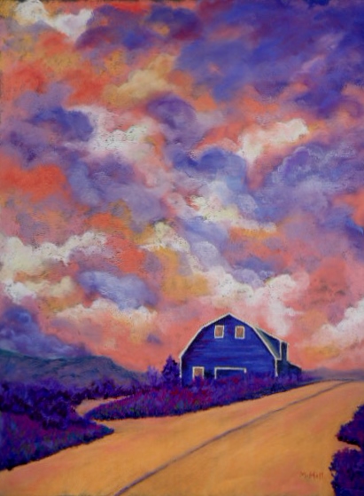
“Ominous,” 18″ x 24″. This was a first for me: it sold before I had it framed or on this website! A “hot-off-the-easel” sale! The sky in actuality was gray and the barn red, but I changed the colors and shapes of the clouds to make more movement and drama.

“River Light,” 9″ x 12″. Lovely quiet water. I enjoyed playing around with the color and adding the magentas to this scene.

“Rosy Morning,” 5 ” x 7″. I went to an all-day “Plein Air Festival” in Jericho, VT. There were 75 artists, three venues, and we painted all day, with the public invited to come and watch. At the end of the day, we showed what we had created. It was tiring! I don’t know that I have the stamina to paint all day. But this is the first painting I made that day. The sky wasn’t really that color!

“River of Corn,” 9″ x 12″. I do love this! This corn in actuality was that soft tan-gold of late summer or early fall, and I made it a glowing apricot color, complemented by the purple and red-orange of the back hills. I particularly loved the sinuous sweep of the cornfield, which reminded me of a river. This painting won an “Honorable Mention” at the Champlain Valley Fair for 2012.

“November Morning,” 9″ x 12″. How soft the colors of November are! My morning walk takes me along this road.

“Tulip 2,” 5″ x 7″. Into the center of a beautiful orange-yellow tulip.

“Tulip 1,” 5″ x 7″. This is the first in a series of close-ups of tulips. I used photos from my prior year’s garden.

“Neon Barn,” 11″ x 14″. This was my initial experiment with color, what fun! I worked out the scene’s values (how light or dark each are was) and chose colors to reflect those values, but not necessarily reality. I like the result a lot. Check out the reference photo below. You can see what happened!

And that’s the reference photo. You would hardly know it, would you?

“Sparrow Farm View,” 9″ x 12″. Here’s a yellow sky, yum. I was especially drawn toward the expressive branches of this tree, as well as the movement in the curve of the pinkish grasses. This is a view from – you guessed it! – the Sparrow Farm, only a couple of miles from my office.

“Purple Swirl,” 12″ x 24″. This is a second take on “Lemon Sunset,” which sold. Since I need a painting of this scene for the themed show, I had to do it again. This is one of my favorite scenes, so that wasn’t a burden! Aren’t the colors delicious? I so enjoyed making the slight suggestion of rows in the field into swirling lines of color.

“Five Kayaks,” 5″ x 7″. This is from a photo I took at Caspian Lake in Greensboro, VT. Don’t you love how the rock in the middle is almost the same shape as the kayaks? I thought the reflection of the colorful boats in the green water was beautiful.

“Rick’s Sailboat,” 9″ x 12.” I did this painting while on vacation this August (2011) at a friend’s lake house on Caspian Lake. I love the soft colors in the lake and sky in the early morning. I painted outside, and the lake and light change fast! This scene is sort of a compromise between how the lake looked when I started and how it looked when I finished the painting.

“Montpelier Quiet,” 6″ x 6″. This is right in the heart of Montpelier, Vermont’s capitol, on the North Branch river. It’s a small painting, just 6″ square, of our small and beautiful city.

“Serenity,” 7 1/2″ x 12″. The name of this painting says it all. I hoped to express that quiet glow in this early-morning winter scene.

“Autumn at the Lake,” 9″ x 12″. This scene is in south-central Vermont. The cool stillness of the lake is a lovely contrast for the fiery foliage.

“The Birdhouse,” 9″ x 12″. This is an early winter morning in Calais, a neighboring town. The shadows on the snow and against the red house were gorgeous. Do you see the birdhouse tucked into the crook of the tree branches?
![]()
“Lemon Sunset,” 7″ x 21″. Oh, I do love this! The original scene was fairly nondescript except for a hint of lemony yellow in the sky as the light faded. HA! You can see that I did with that! It’s hard to see in this little thumbnail photo, but the clouds (and the field, for that matter) are purple, magenta, and orange. Yum.

“Overhead,” 16″ x 20″. I struggled with this painting! I went through two complete color changes with the sky and three with the field. But I am finally pleased with it; it expresses something of the dramatic sky that day and the sweep of the stark hillside underneath.

“Midnight, Twenty Below,” 9″ x 12″. This was the view from my bathroom window on a very cold January night. I think it was actually eighteen below zero, but I took artistic liberties with the title!

“Evening Gold,” 12″ x 18″. I did this in a class given by Liz Haywood-Sullivan on painting skies. What a wonderful contrast to my usual workshop fare for my “day job”! I worked from a photo I took while in a canoe out in Caspian Lake in Greensboro, VT. It was so beautiful to see that dramatic sky with the gold reflected in the water.

“Cherry and Sycamore,” 9″ x 12″. Ah, spring. I did this in a park near the Finger Lakes in upstate New York, while visiting my cousin there. The sky was overcast and threatening, the sycamore not yet leafed out, and the cherry tree an amazing blast of pink with a shaft of light on it.

“In Winter’s Grip,” 9″ x 12″. This tree is right up the road from where I live; I go by it every time I walk in the morning. I love its shape. I don’t think you can tell with this wee photo, but I put subtle lines of bright color along some edges of the tree, suggesting the life force of the tree even in the grip of deep cold.

“Little Blue Eyes,” 5″ x 7″. I liked the morning glories in “Heavenly Blue” (on the “Flowers” page) so much that I decided to make another smaller version of the same scene. Can you see the subtle differences? Art is never a copy!

“Sky Road,” 12″ x 16″. This was a very blah scene, color-wise. The grasses were dry and pale gold, although green on the right: the road a nondescript tan: and the sky gray and white. But I liked the shapes and the lovely curve of the road. Look what a little inventive color can do! I made the cloud shapes echo the road subtly, which I think adds a nice movement to the scene, too.

“Frosty Whitethorn, Tipperary,” 12″ x 26 5/8″. This was inspired by a photo taken by my cousin when she was visiting family in Ireland. They’d had a frost, which is very unusual there, and everything sparkled with it. I used iridescent pastels to capture that effect. I love this painting!

“November’s Gravity,” 16″ x 20″. This painting started in my mind long before I ever started painting at all. In November, the sky is often a leaden gray; it looks so heavy. In contrast, the apple trees, their leaves long gone, still hold the apples like a cloud among the branches. They don’t look attached to the tree; they look as if they might float right off into the sky! It seems like gravity is all mixed up, with the floating apples and the heavy sky. Look carefully at this little thumbnail photo, and you will see the apples floating off into the upper right of the painting.

“What the Sunflowers See,” 18″ x 24″. This is from the same sunflower field as I painted from in “The Fire of Sunflowers.” The flowers are looking at the view! Although this has sold, I have a canvas print of this painting available. It is 12″ x 16″ and is priced at $75. Not quite original art, but the next best thing!

“Autumn’s Fire,” 12″ x 18″. I started experimenting with using the color that was really in the scene (more or less!) and amping it up until the painting was very lively and saturated with color. Here is one result. It’s a fall scene, and so is colorful anyway, but I love how vibrant this is! It’s one of my favorites.

“Shadows on the Road,” 9″ x 12″. The play of light and dark caught my eye, as the title suggests. I made it even more obvious by making warm peach light and cool purple shadows. Isn’t art fun?

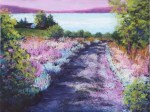
“Hidden Pond, Greensboro,” 9″ x 12″. This pond is not very hidden, but is near the road although tucked back a little. I liked the soft colors of the light and the joe-pye weed, and decided to accentuate those with a pinkish-lavender sky.

“Lake and Shadow,” 16″ x 20″. This is a scene of Caspian Lake in north central Vermont. I was out early in the morning and was struck by the gorgeous angled shadow of the elderly tree.

“The Fire of Sunflowers,” 14″ x 20″. While on vacation at Caspian Lake in Vermont, I was driving around looking for places to paint. I saw a bright stripe of yellow up on a hillside and discovered this field of sunflowers. A quick trip to the nearest farm and I got permission from the farmer to paint there. This is the result.

Love the whole concept of ICE CREAM AND FERNS! Very imaginative, and the patterns and colors play off each other in such a complex, entertaining way.
I’d like a black raspberry creemee/chocolate twist surrounded by many others; a forest of creemees, please. Sprinkles would be good on some. Enough to give you brain freeze.
It is indeed a delight to think “outside the box” and have fun with food as art object. I would go for the cinnamon buns and suggest you study soymilk creamees, if there is such a thing.
You are sooo talented! I want to walk in every field you have painted, look at the skies from your vantage point, and definitely eat the cinnamon buns you painted. Oh, and that sail boat is inviting. I feel like I could jump in and just push off from the shore.
Love it!
How gorgeous your paintings are Marcia. Your colors are magnificent. It makes me long for the seasons you see in on the East Coast. I feel blessed to be on your mailing list. Yes, I want to pre-order 2 of your calendars, one for a gift to a friend. I will go back to the original email to see how i do that. My best to you always, my old feminist therapy friend! Warmly, Lauree
It is such a delight to see your work and think of the transformation you have made from therapist to artist.
Enjoyed your art and use of vivid colors. Right now I paint and give or donate my art, but mainly paint for myself. My blog is ‘A Journal About Art and Life’ mostly about the creative process.
Hi Marcia, I am thrilled!!!! Each painting is incredible and gives me goosebumps! The hues of nature, emotions of people, stories of houses that are being told without words…. phenomenal! “December walk” is in fact a picture i had in mind for a story I had written! Thank you so much for giving such happiness through your craft!!