A couple of weeks ago I did a little three-day art retreat with an artist friend. We were at my home. I cleared out part of a room that had good light and we set up our art stuff, brought along plenty of materials and ideas, and spent three days painting. When I say “three days,” what I really mean is three 5 hour days with a brief lunch break. Painting takes incredible focus, and five hours of it just wiped us out. There is a reason the results are called “art work“! I know there are professional artists who work all day, but they have spent years building up to it. I usually work no more than a few hours at a stretch.
I made five paintings. Two are losers. Maybe I will eventually do something with them, but maybe not. One was not quite finished and I tweaked it over the following few days. But I will show you all of them here, in the interest of letting you see how erratic the process of painting can be. Years ago, when I first started painting, another pastelist invited me to see her studio. I remember her explaining her process, and at the end she said something like “…and if it’s not a success, I throw it in the fire.” It was wonderfully freeing. Not all paintings are a success, even for the most accomplished artist, and certainly not for me. Occasionally I can go back to one and change it up until it becomes something I like, but some just never see the light of day.
Here they are, in order in which I made them.

“Observation Post,” 8″ x 8″. I had already given some thought to how I wanted to approach this, which was very helpful. I knew that I wanted to add direction and texture to the sky to offset what was a fairly static image. I knew that I wanted the tree needles to be spiky and rough for the same reason, to add interest to the image. When I finished I was still not completely satisfied and felt that the color palette lacked spark. I added a line of red to the breast of the crow, which pleased me. It’s an ART crow, it’s not a real crow! And then I put a sprinkling of red in the tree as well. I quite like this one.

One of the losers. I feel that it just is not that good, and I’m not sure what I would do to salvage it. It’s from a photo I took in New York City, of all places, because I liked the curve of the trees. I do still like the concept, though, and may try again at some point.
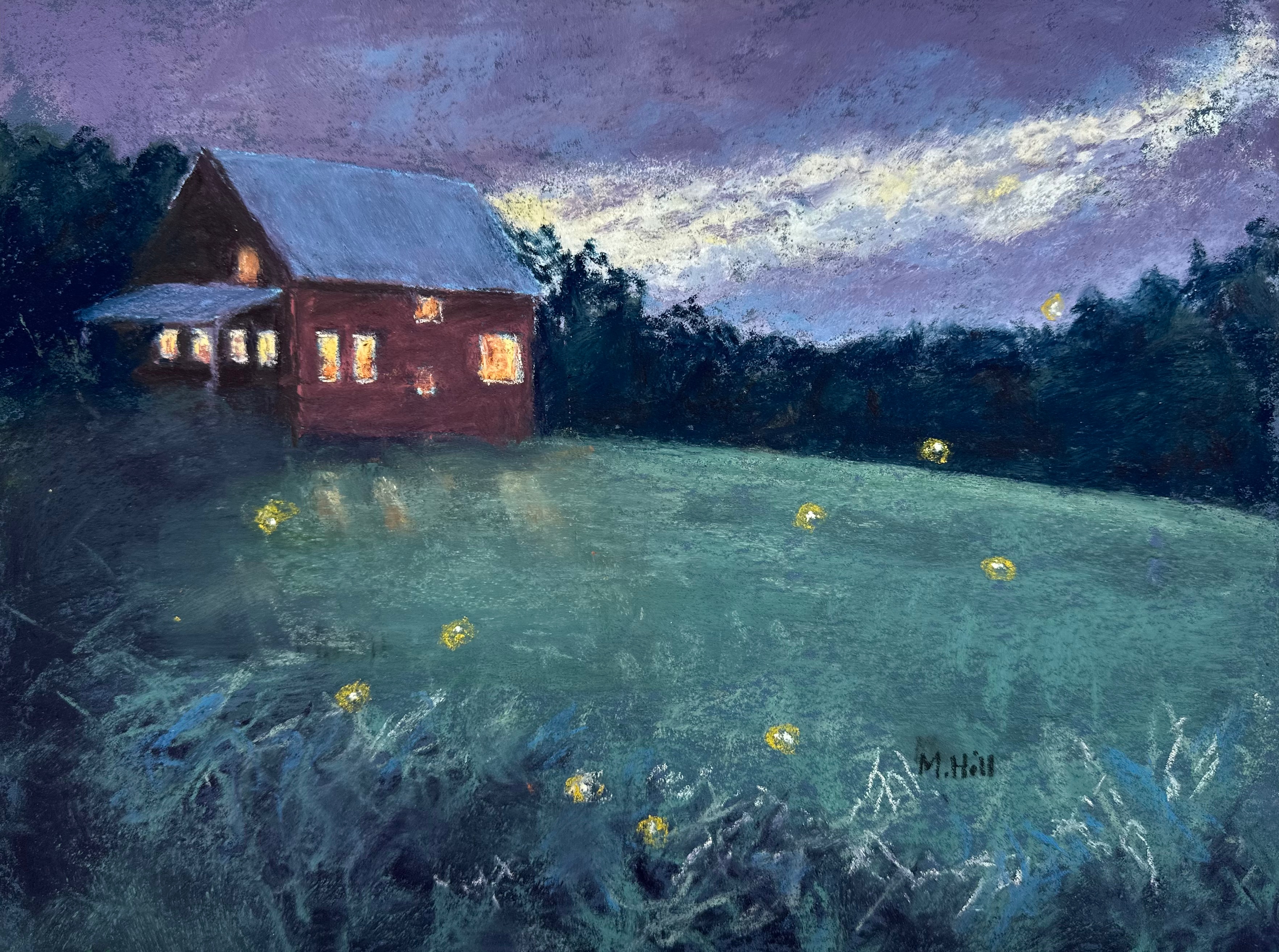
“Night Lights.” I did get as far as titling this, but I still feel liken it is not quite “there” yet. It’s like the crow painting before I added the red – just a little too blah. I may go back to this if I get inspired about what it needs. Not a bad painting; it’s just not a good one.
At this point in the retreat, I was feeling discouraged. Three paintings into the process, and I only had produced one that I liked enough to frame and post. But I thought of an art workshop I took in which the instructor talked about the “four Cs” in art. They were concept, composition, color and commitment. Sometimes you just have to keep going. So I did.

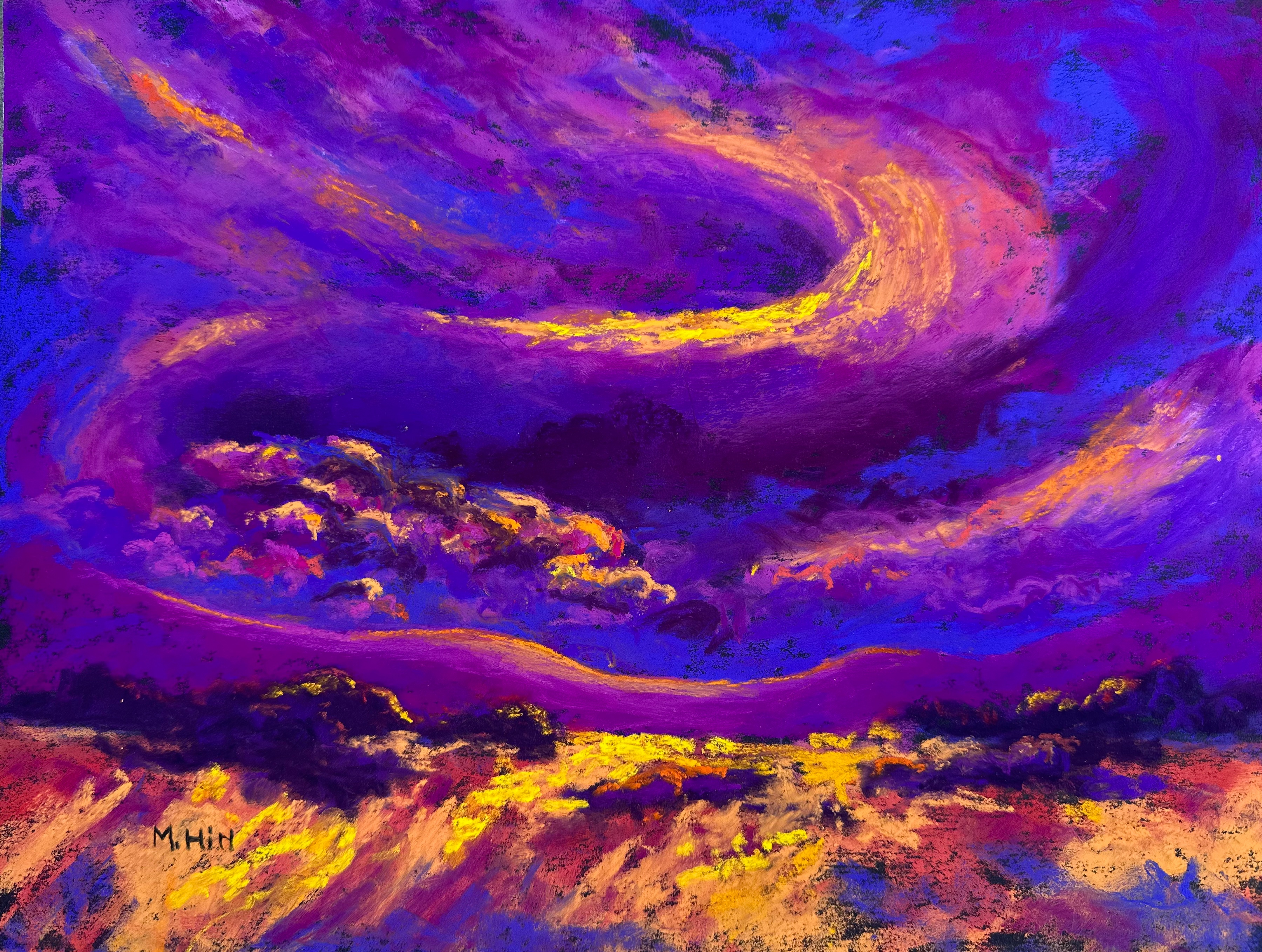
“Origins,” 12″ x 18″. This is an interpretation of the origins of the universe. I was intimidated by the challenge of it, but I also really wanted to do it. So I did a couple of sketches first to figure out the composition, and then a very small version first (4″ x 6″), to see if I could work out color and other details. My artist friend suggested subtle shading of the background instead of pure black, and that helped. I finished the painting itself fairly quickly for something this size, probably because I had done all that preliminary work. I like it! It has drama and mystery, which I find intriguing.
“In My Mind,” 9″ x 12″. I did use one of my photos to remind me of a pattern in the clouds that I liked, but most of this was simply invented (thus the title). Really I just wanted to play with these colors: I just find purple, magenta, and gold so delicious. It has a vaguely landscape-y quality, but the landscape is really just in my mind. Even something that seems so loose and made up like this takes a lot of work to get the color balance, values (light and dark) and composition working. But it was fun to do.

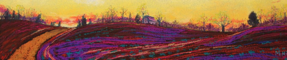
“Scotland Forever,” 11″ x 14″. The reference photo was one I took in Scotland, land of heather, ancient stones, and brooding skies. The painting is not unlike the photos, but is more vibrant, of course, and I moved the tree to help the composition. I did a fair amount of color and value adjusting with this one, and this is the painting I continued to revise over the next few days. At first it was just too uniformly purple: purples in the skies, purples in the heather. I love the color and it’s a mistake I can make quite easily. Ultimately, I complicated and lightened the colors in the heather, adding muted pinks and blues. There are at least six or eight hues in there. I incorporated some soft gray-blue in the sky. I added in more grasses to give the scene the messiness of a real-life field. I recently discovered from an ancestry DNA site that I am a wee bit (as they would say in Scotland!) Scottish!
And that’s it. A productive three days. Wearing, discouraging, fun, and satisfying – which is pretty much how you might describe anything worth doing.

Hello Mimi,
Good to see your art and read your writing again.
Keep creating!
And thanks for guiding me back to Worcester. The yellow tinted glasses are awaiting my next night drive.
Frank Peterson
I hope the glasses work for you!
http://www.marciahillart.com