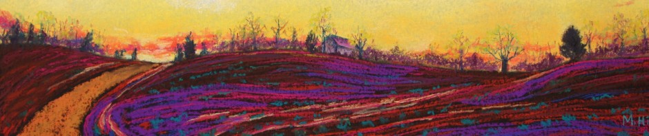
Often I paint more or less what it in front of me, but this most recent painting is nothing like the photo! (Well, a little like it.) It’s a portrait of my home town, Worcester, VT. The view is one all Worcesterites know, from partway up the hill opposite the one on which I live. Here’s a photo from this fall:

This was my starting point, then I set about making changes. The autumn colors would be a distraction for this piece, so I changed it to summer. I stylized the mountains, added more layers of them, and made them purple, well, because I can! And because I liked it! Same thing with the yellow and orange in the sky: Yellow is purple’s opposite, and the two together just sing. Further, the sky and mountain colors, because they are not real, communicate the magical quality that I wanted. I created a greater sweep of field, because I wanted the additional contrast between the visual smoothness of the field and the texture of the forest. I eliminated many of the buildings, choosing just a few to represent the whole. I liked that most of the buildings are white, but I made a couple more of the roofs red, so that the red of the barn-like structure on the left had a little visual company. Here is the result:

“Worcester Village,” 9″ x 12″

I love reading about what you did and why. How did you get so smart about art and color and texture?
It’s learned, like everything else. Who knew?
It is indeed magical and I imagine that all sorts of magical folks live here, possibly including gnomes, wizards and talking frogs. Thank you for stroking my imagination.
Gail, your world will always include those things. Especially the talking frogs! It’s one of your gifts.
So, my question is: Can you do this with reality in general? If so, I’ll sign up for a class. Jut kidding. I very much enjoy how you discuss your process. I love the finished result.