I love powerful colors: they can make you look at a landscape in an entirely new way. The last three paintings I’ve made reflect this. Here they are. I’ve included the reference photos that I worked from, because it’s worth seeing the liberties that I took with color and other elements, especially rhythm and movement.

Here is the first reference photo. I liked the sweep of the field, with those tractor ruts, moving your eye around to the distant trees.

And the completed painting: “In Green Pastures,” 12″ x 16″. See how I exaggerated the swirls of the field? I added foreground elements so that the scene did not just “fall off” the bottom of the page. And of course I amped up the color and the curves of the hills. This is the feeling of the scene, at least to me, if not the literal actuality!

Here is the next reference photo. This is Caspian Lake, in Greensboro, VT. I responded to the layering here: the foreground goldenrod, the curve of fields with trees, the lake with the hills in the distance.

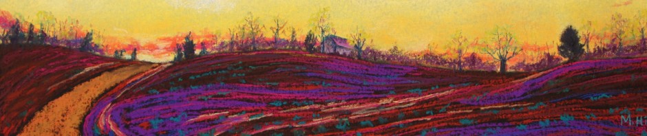
And the result! “Yin-Yang Landscape,” 12″ x 16″. The title refers to the contrast between the quiet of the lake and the fiery movement and color in the foreground. Yes, the elements are all there, but would you even recognize this scene? The colors are not only exaggerated, they are changed; the fields now include purple and dark red. I made the foreground shades of turquoise to harmonize with the color of the lake. And the goldenrod became some dark red flowers from my imagination, the better to contrast with that bright green field. I repeated colors: the red in the field and the flowers, the turquoise in the lake and foreground, and the purple in the distance as well as in the field’s shadow and the foreground. I am very pleased with the result!

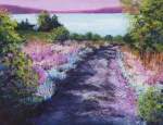
And the final reference photo. It’s washed out, but you can get a sense of the image: a driveway leading to the lake (this is also Caspian Lake) and a home in the distance among the trees. The grasses appealed to me here, as well as the slightly mysterious quality of the road and the partially-hidden house. Here’s the painting:
This is “Headed to Camp,” 11″ x 14″. Now the focus is almost entirely on that camp road, the grasses, and the shining destination of the lake. The house is barely visible. I used a limited palette of magentas, light turquoise, greens, and a touch of gold. I do love the effect of those colors on the grass. I “moved” trees and bushes to frame the scene. And, hey, I can make a light magenta sky if I want to!
With all of these paintings, I used a similar technique. They are done on black paper, which I have allowed to show through for texture (for example, in the camp road) or for rich darks (in all three of the paintings). I often exaggerate color and movement, but I have carried that further than usual in these paintings. I spent a lot of time thinking about how I wanted to proceed and about colors, although as with any painting, the painting itself starts to make demands after a while. And I worked slowly, considering almost every stroke. Since I wanted to make use of the black paper, I couldn’t just cover it up. I am very happy indeed with the results.
So for your next painting, go BOLD!

You’re actually a very good photographer too, Marcia – in another style than your paintings. I particularly loved the last one of the road – wow! what fun and daring! I’d like o see it in real life and maybe buy it…
I like your psychedelic colours in the field of flowers.