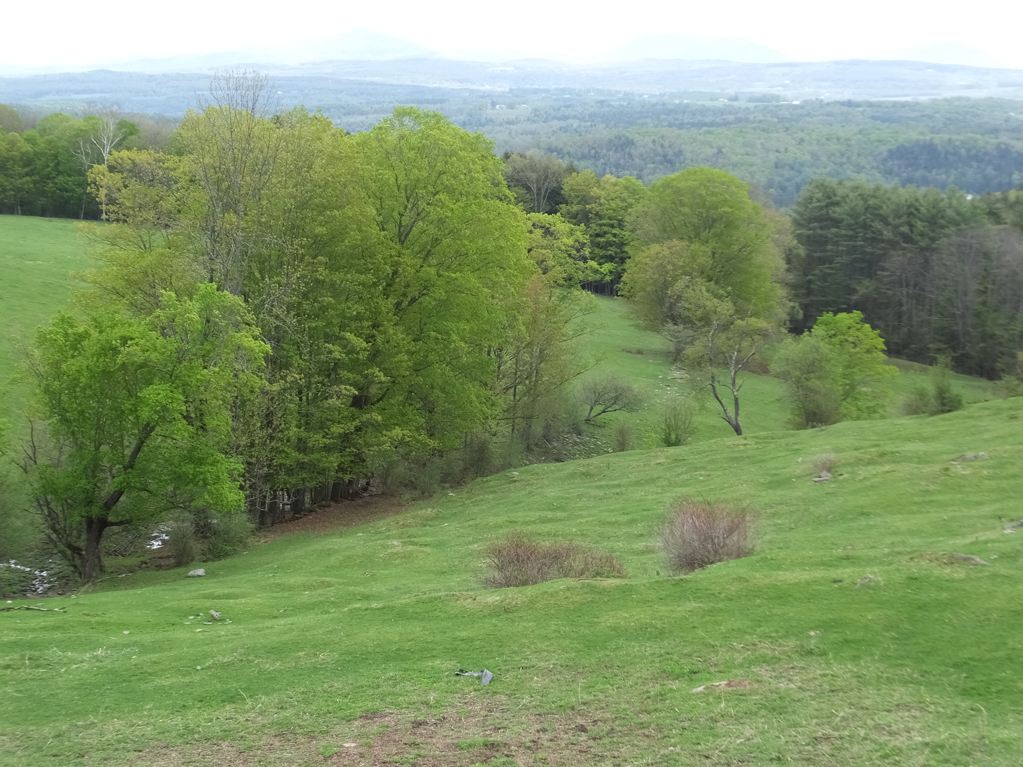
I took this photo this past May. Doesn’t it just sing of Spring? Robert Frost says, “Nature’s first green is gold/ Her hardest hue to hold.” That delicate spring green only lasts about three weeks and is gone, transformed into summer’s darker and sturdier greens. This scene has that lovely spring green in both the grass and the trees, and I very much wanted to paint it. But when I sat down to do so, I realized that it was not going to be easy.
The composition of the photo was great: see the way the lines of the hills lead your eye back and forth diagonally through the scene? So that part needed no adjustment. And the way that the far hills faded softly into the sky also was lovely just the way it was.
But there were two challenges, and they were significant ones. First, most of the scene is the same color! Yes, you can see slight differences in the greens, but they are indeed slight. The darker parts of the grass and the lighter parts of the near trees are almost the same color. And even the darker parts of the trees are not so much darker. And, for that matter, the near trees are very close in color to one another. Now, I did not want to change that too much, because all that juicy green was exactly what attracted me to the scene in the first place. But I was going to have to create more variations or I would end up with a painting that looked too uniform.
And, speaking of too uniform, the second challenge is that most of the painting is the same or similar value! “Value” is an art term referring to how light or dark something is. Changes in value are critical to making a painting interesting. In fact, I read somewhere – or perhaps heard it at a workshop – that “value does the work and color gets the glory.” That means we notice color but it’s the variations in light and dark that really are responsible for drama and interest. Yes, that scene has darker trees in the background and a darker line under the near trees. But the near trees and grass are very close in value. It was an overcast day when I took the photo, so there were no shadows or bright areas. I was going to have to invent value changes!
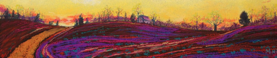
Here is my solution. I made a number of changes in the colors, without, as best I could, deviating too much from the yellow-greens of spring. The two hills are different greens, with the nearer hill being more yellow and varied in color. I’ve varied the greens in the near trees, too, making the largest tree quite yellow-green, two smaller (and further away) trees also yellow-green, but a softer version, and that smaller nearest tree a light green but not as yellow. I’ve also found excuses to add soft ochres and orange-browns and even pinks here and there. They were indeed in the photo, but much, much more muted.
And you can see how I emphasized and even invented greater value changes than those in the photo. I’ve kind of “pruned” the lower branches of the near trees to emphasize the dark trunks and branches. I’ve exaggerated that little trickle of bright water in the lower left. And I’ve lightened the back grassy hill to make it a different value than the front one, as well as to emphasize the contrast between that hill and the dark line of the further trees. I do like the resulting sweep of that hill against the dark trees.
Every painting has technical problems, things that you need to change in order to make a good piece of art. That’s true even when the artist is being relatively true to the reality (as I am in this painting) and is not making more dramatic changes to convey feeling. This one had bigger challenges than most! But I do like the result, which I have named “Verdant,” for obvious reasons.
