I have two new paintings. In both, I pushed color as a means of expression, and I like the results very much. To keep this blog to a reasonable length, I’ll describe them one at a time in two blog installments. Hey, you have something to look forward to!
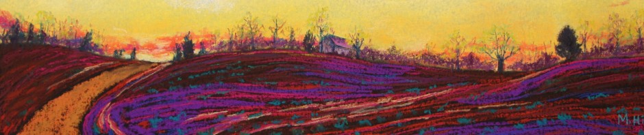
The first painting is “Along the Way,” an 18″ x 12.” First, look at the reference photo:
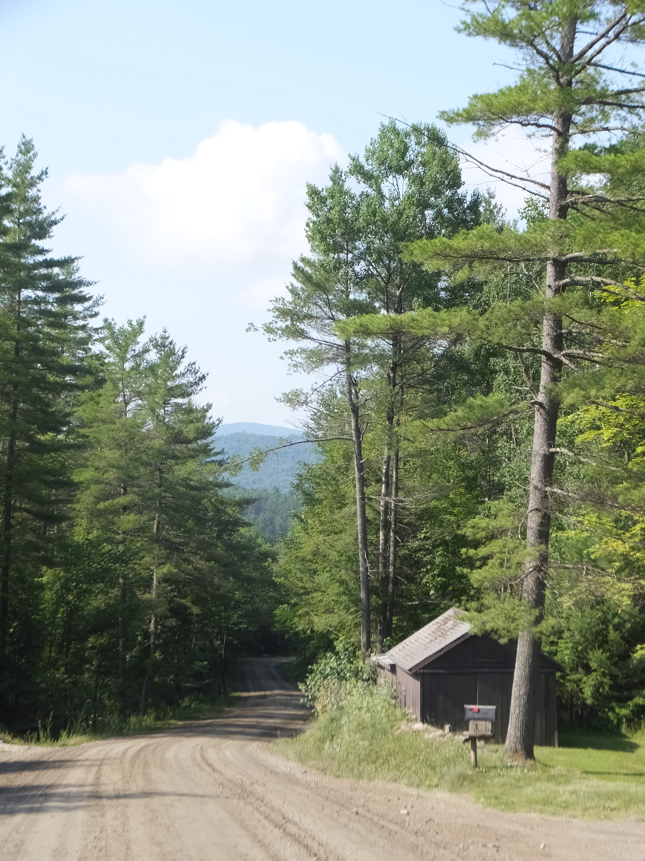
This is a fairly ordinary scene, but I liked the way the trees towered over that small shed. And the contrast between the sinuous curves of the road and the linearity of the pines appealed to me. But I felt that it needed some punch. So using the wonders of the computer, I distorted the entire scene toward red. Here is the result:

Now, that was interesting! I didn’t want to make a painting that was entirely red-orange, though. Then I considered that red and green are opposites on the color wheel, making for great visual contrast. I decided to keep the green of the tree leaves and pine needles — as well as the natural color of the sky — and go ahead with the red distortion everywhere else. Here is the painting:

I made the red much softer, but it is still most definitely there, even in the far mountains. The red makes the tree trunks stand out from the pine needles, which creates much more emphasis on that linearity. And I think the red – green combination makes for a far more rich and compelling painting than if I had stuck with “reality.” It has a somewhat Western feel, although the scene is right here in Middlesex, VT.
“Reality is overrated,” the saying goes, and when it comes to art, I generally agree. I admire realistic paintings, but I don’t want to make them myself. I want my art to say something more than the actual scene. I think this painting does just that.

Love your process with this painting Mimi! I agree that it has a western feel to it, too.
I liked what you did with color. What talent!
Sue
Hearing about your process is very interesting.