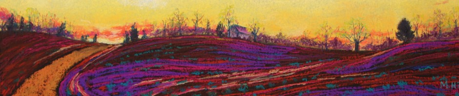
I change color in a variety of ways so I can better express the feeling of a place, but there are a couple of recent paintings (see prior blog) in which I pushed color primarily in one direction. The last painting was a push toward red; with this painting, I went toward blue. Here’s the reference photo:
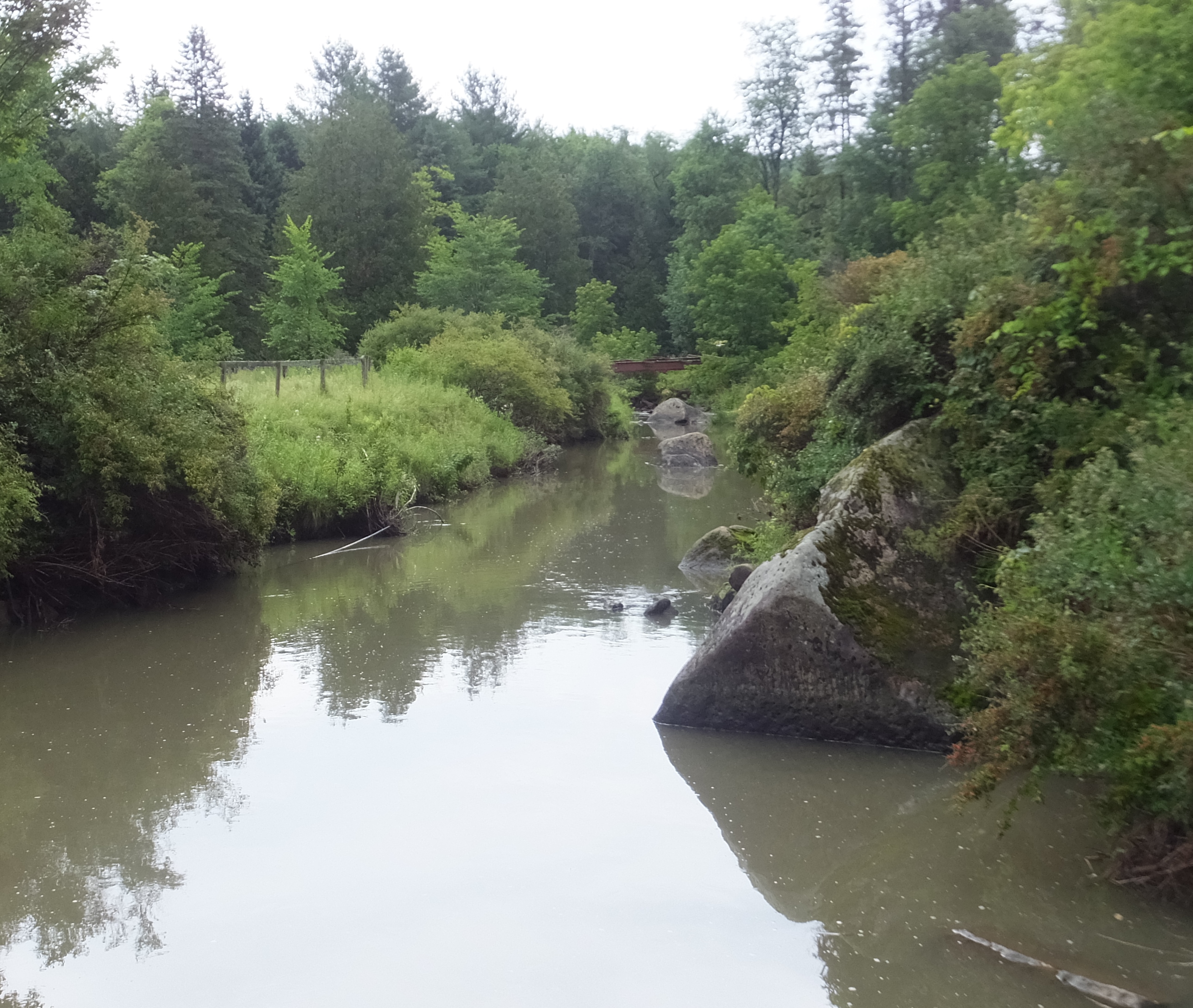
This is the Black River, in Craftsbury, VT. I was delivering art to the Art House up there and mentioned that I was taking reference photos. The woman working there suggested I go look at the river right behind the building and this is the scene. Thank you, Ceilidh!
The composition is great, I think, with that wonderful triangular rock cutting into the bright reflection in the water and the angle of the river as it disappears into the distance. But to my mind, the colors add nothing in particular to the scene. The softness of the colors is appealing, but I wanted a way to express the depth and distance of the river’s path, the quality of something almost like secrecy as the river slides out of sight. I fooled around with possibilities, and this is what I liked best:
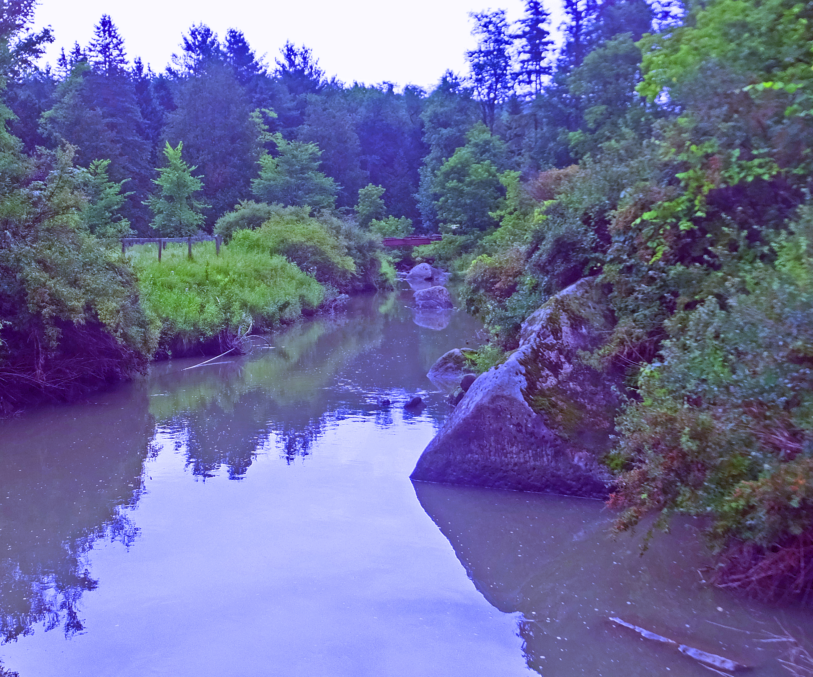
Mmmmm, look at those blues! They add a coolness to the scene and exactly the mysterious quality that I wanted. Here is the painting itself:
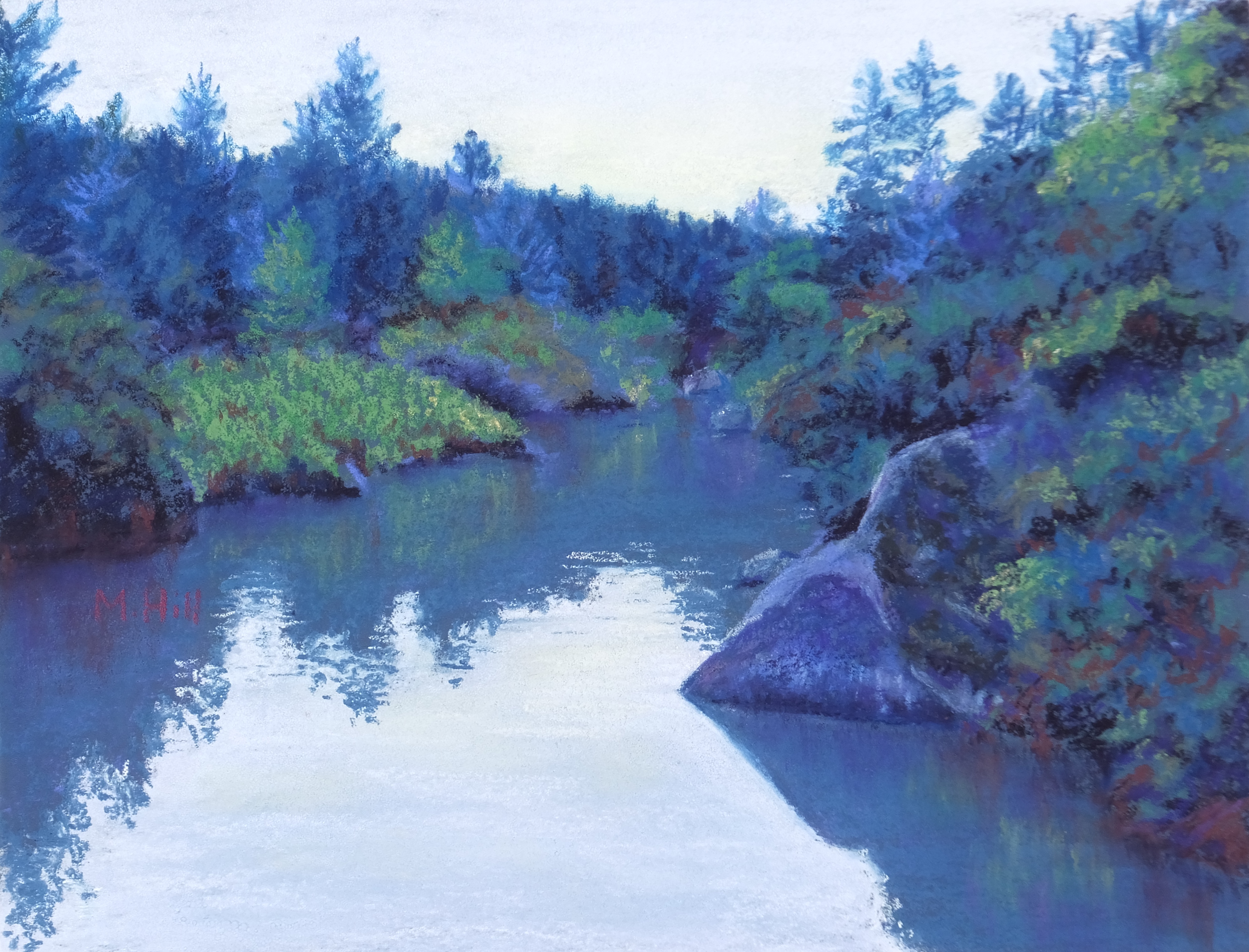
I preserved the softness of the original scene, especially in the reflections in the water. Interestingly, I have discovered that while reflections can appear quite sharp in actuality, they look artificial if you paint them that way. The entire painting is much more blue, not unlike the second (altered) photo. However, it still look real, almost as if it could have truly been these colors. This is because I have kept the relationships among the colors accurate, including relative darkness and lightness as well as the variations in blue and green. The one thing I did change was the lightness of the sky and the sky’s reflection in the water. Those I made brighter than my altered photo, wanting to emphasize the mirror of the water, which after all, was much of what attracted me to the scene.
And there it is, from original photo to concept to painting. To my mind, the most important part of painting is not the faithful rendition of what you see (although I greatly admire artists who do this!), but the addition of feeling, of something to convey the spirit of the landscape. I titled this painting “Cool River Depths,” and I hope it conveys just that.

Colors do enhance the mystery, I think. I love your calender and enjoy looking at it every day!
Great Job! I enjoy seeing the original and your final product.