In less than two months, our world has changed dramatically: We now live in the time of a plague. Many have said that the world will never be the same, and it is my fervent hope that humanity in general, and the United States in particular, can use this as a portal to transformation.
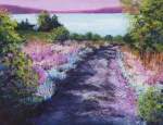
I was working on a painting of a winter tree as things started to unfold, and without any particular intent on my part, I found the painting taking a somewhat unusual turn. It was stylized, with shimmering color. It was clear to me that the painting was no longer a portrait of a winter tree, but now represented something about the onset of the pandemic. Here is “Pandemic 1.”

Almost as soon as I finished this painting, another image occurred to me. This has not been the way I have usually painted. Almost always, I start with an image, generally a photo. I may change some of the particulars, and in fact I often do. Sometimes I turn the image over in my mind for hours or days, looking for ways to help the painting reflect what I want to express. But in this case, the image shaped itself in my mind, and I explored it mentally as a way to imagine the final version. I have heard it said that you cannot create what you cannot imagine, and I find that true in life as well as art.
Here is “Pandemic 2.”

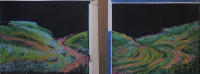
I had no sooner finished this than I knew what the next painting was. Thus, “Pandemic 3.”

It took a while, but only a matter of a few days, to know what the next image would be. In this case, I started more directly with a feeling I wanted to portray, and then got a sense of the basic shapes, and finally worked out the colors. Some of the final decisions were made at the easel. “Pandemic 4: Some Will Live and Some Will Die.”

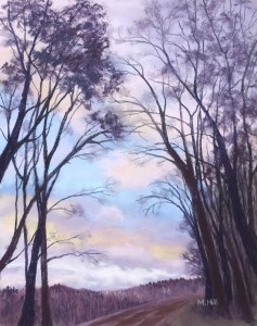
Finally, the most recent, completed two days ago: “Pandemic 5.”

Each of these images has significance to me and each expresses something about the experience of living in these times. But I will refrain from saying my interpretation. (Except, of course, for “Pandemic 4,” which is the only one that I knew had an explanatory subtitle. Interestingly, it’s the only abstract as well.) Art belongs to the viewer as much as to the artist, and you will have your own meanings for these paintings.
I already know the gist of the next image, and am in the process of working out some of the particulars in my mind. This whole process has been so interesting. Although all of my art is expressive, I have never created in this way. The art seems to have its own agenda.
Be well. Stay safe. Create something.


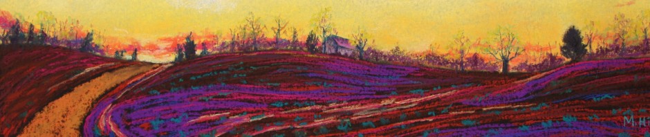
 “Fall Layers”