I am just back from a month in Tucson. I have never taken a vacation that long….retirement is great! Traveling with art gear is not so easy, but I wanted to take advantage of the change of scene to make art. So I cut back on how much clothing I brought. Hey, you have to have priorities!
I do love the Sonoran desert, especially the saguaros. They have such personality: except when they are quite young, each is unique. The Native people, the Tohono O’odham, say that they are like people, and it’s true. Here is “Saguaro Silhouettes,” which shows a few shapes, but they come in fantastic shapes, everything from the iconic two-armed version, to very many twisted arms. I invented the sky here, which in reality was variations on gray. I do love magenta!

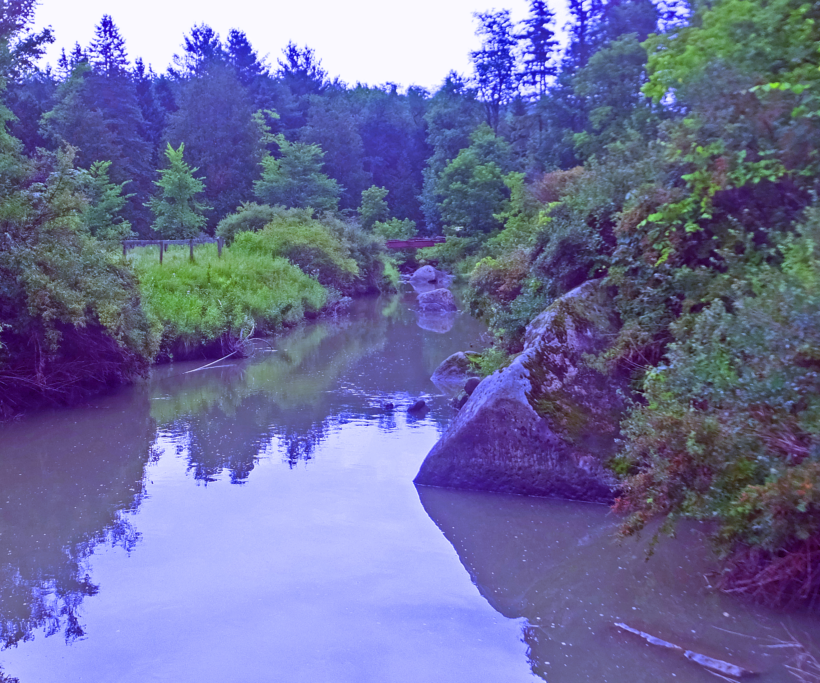
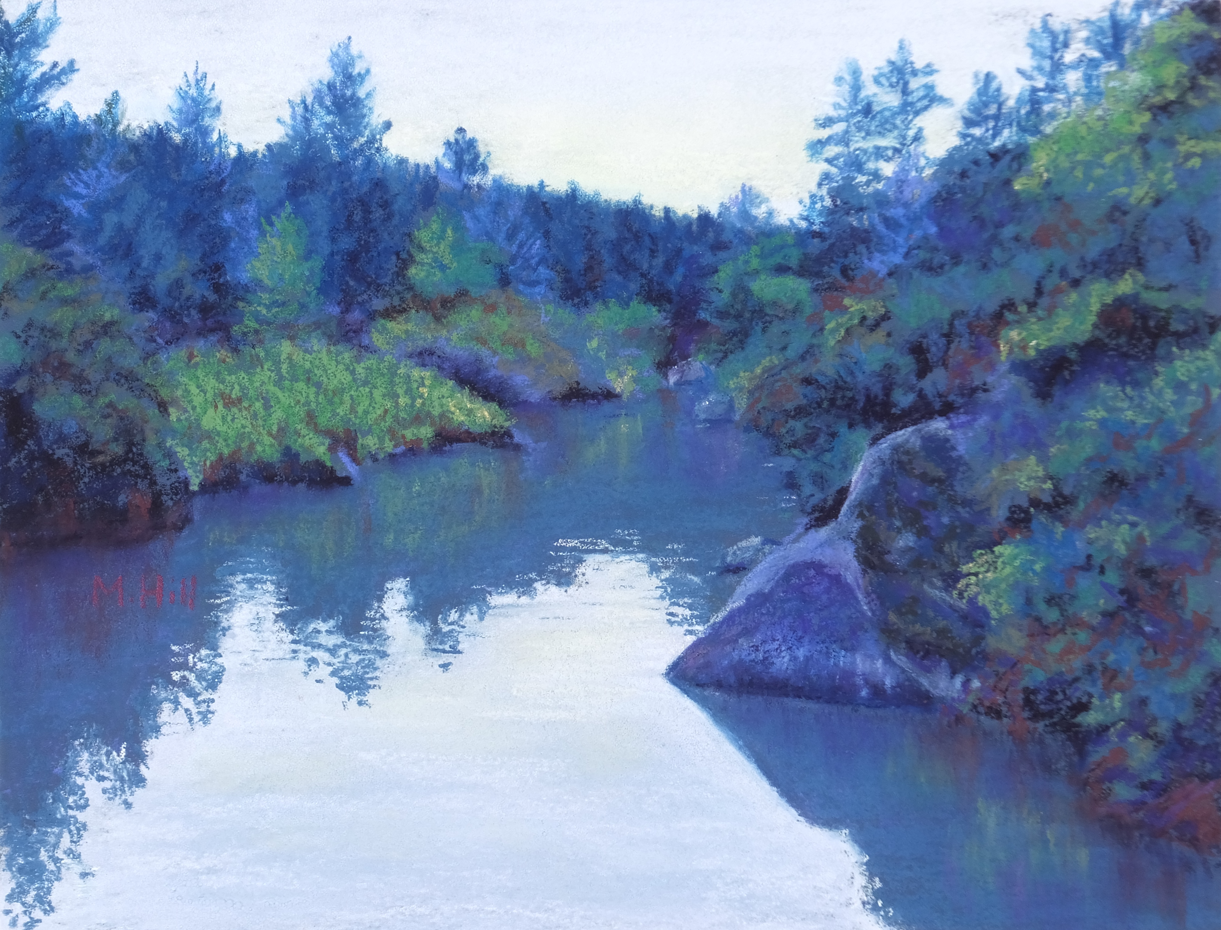
Everything abut the desert differs from my familiar Northeast landscape. The mountains, much younger, are jagged, and almost look artificial to my eye. “Thimble Peak Sunset,” below, shows some of this, with layers of rugged mountains. Thimble Peak, the tallest in this image, is certainly well-named.

Every plant and animal, it seemed, was new to me as well. I enjoy learning about another ecosystem. I’ve been to the Sonoran desert a few times, learn the plants and animals each time, and then forget them and need to re-learn them when I go again. But of course that is part of the fun. Here is a more intimate landscape, “Desert Companions.”

As an artist, I am especially tuned in to the colors of a landscape, and the desert’s colors were a change as well. The greens are generally more muted, often a gray-green. In fact – with the glaring exception of desert blooms, which are spectacular – the colors in general are softened compared to colors in the East. But the shapes make up for it! I’ve already mentioned saguaros, the soul of the Sonoran Desert, but the chollas and prickly pears have varied and fascinating shapes as well. The prickly pear pads look almost balloon-like, albeit flat, and I decided to play with that idea in this next painting, “Neon Cactus.” I really had a lot of fun with this!

Finally, I did make one watercolor while there. I was amazed to see the birds routinely perching on cacti. They are covered with thorns! I don’t know how the birds do it, but I guess if you live in a desert, where most everything has thorns, you get comfortable with that. Here is “A Prickly Perch,” which conveys just that.

It’s a good thing to paint new environments occasionally. Much as I love the forests of the Northeast, a visit elsewhere is a vacation for my vision. It’s a challenge to my painting habits as well. I rented a condo when I was there, and the woman in the condo above me confessed that she would lean over her porch railing so that she could see what I was painting. I invited her in to see the paintings, of course. Taking the trouble to spy on art in progress is a complement!